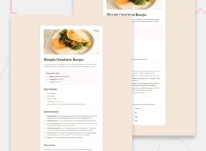
Design comparison
Solution retrospective
I am most proud of creating a visually appealing and user-friendly recipe card that effectively communicates all necessary information for making a simple omelette. The layout is clean and organized, with clear sections for ingredients, instructions, and nutritional information.
Next time, I would explore adding interactive elements, such as buttons to toggle ingredient quantities for different serving sizes or an option to print the recipe easily. I would also consider incorporating user feedback earlier in the design process to ensure that the layout meets the needs of a broader audience.
What challenges did you encounter, and how did you overcome them?One challenge was ensuring that the design remained clear and readable while including all the essential details. It was important to balance text and visuals to maintain interest without overwhelming the user.
To overcome this, I focused on using a structured layout with distinct sections, clear headings, and appropriate spacing. Additionally, I chose a font that is both aesthetically pleasing and easy to read, ensuring that all text is legible across different devices.
What specific areas of your project would you like help with?-
Design Enhancement: I would appreciate feedback on how to enhance the visual design further, such as color choices and typography, to make the card more engaging.
-
Accessibility: Suggestions for improving accessibility features, like text size adjustments or alternative text for images, would be beneficial.
-
Interactive Elements: Advice on incorporating interactive features to improve user experience and engagement with the recipe card.
-
Responsive Design: Tips on ensuring that the card design adapts seamlessly to various screen sizes, especially on mobile devices.
Join our Discord community
Join thousands of Frontend Mentor community members taking the challenges, sharing resources, helping each other, and chatting about all things front-end!
Join our Discord
