Design comparison
SolutionDesign
Community feedback
- @ddosiaPosted 5 months ago
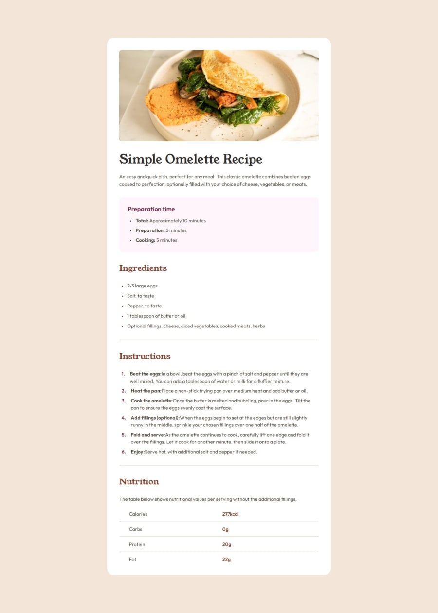
Looks very clean and close to the design image.
I like semantic tags, I though of using "sections myself, but then I put "article" as a root tag and changed my mind. I'll probably update my solution to have it as well.
Also I like Nutrition being a table. I had bad time trying to make it grid.
2 - @MehmetAydar01Posted 5 months ago
Nice work. Your project is perfect and fits the design.👏👏
1
Please log in to post a comment
Log in with GitHubJoin our Discord community
Join thousands of Frontend Mentor community members taking the challenges, sharing resources, helping each other, and chatting about all things front-end!
Join our Discord
