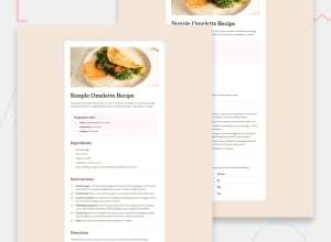
Design comparison
Community feedback
- @crossinguardPosted 6 months ago
Solid submission! You code is easy to follow, your submission looks good at all realistic screen sizes, and it matches pretty well to the expected output.
The font is different from the style guidelines, but that seems intentional. I would recommend still using 2 fonts to keep a bit of the visual diversity in the headings, even if you don't use the challenge's suggested fonts.
Additionally, while your mobile-sized solution looks good, it is missing what I consider to be the most interesting part of this challenge (from a dev standpoint). As the size gets smaller, the recipe image should lose its padding and instead go edge-to-edge. Similarly, a distinct card and its rounded borders shouldn't be present on the mobile version. If you are looking for an extension, I would try and figure out how to get both of those design elements incorporated.
0
Please log in to post a comment
Log in with GitHubJoin our Discord community
Join thousands of Frontend Mentor community members taking the challenges, sharing resources, helping each other, and chatting about all things front-end!
Join our Discord
