Not Found
Not Found
Not Found
Not Found
Not Found
Not Found
Not Found
Not Found
Not Found
Not Found
Not Found
Not Found
Not Found
Not Found
Not Found
Not Found
Not Found
Not Found
Not Found
Not Found

Submitted

recipe-page-main

@mohamedsaad2006

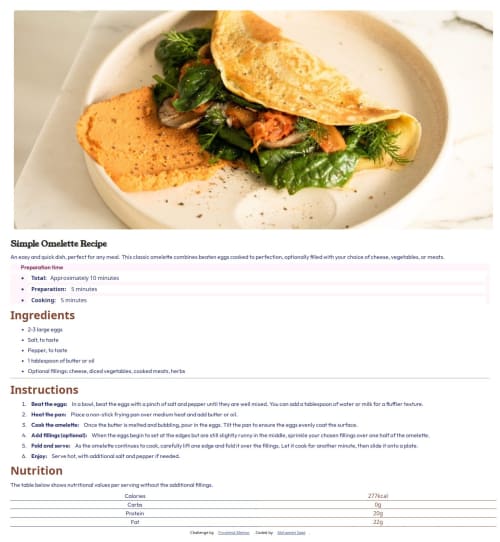
Desktop design screenshot for the Recipe page coding challenge

This is a solution for...

  • HTML
  • CSS
1newbie
View challenge

Design comparison


SolutionDesign

Solution retrospective


What challenges did you encounter, and how did you overcome them?

Does the solution include semantic HTML? Is it accessible, and what improvements could be made? Does the layout look good on a range of screen sizes? Is the code well-structured, readable, and reusable? Does the solution differ considerably from the design?

Community feedback

@krushnasinnarkar

Posted

Hi @mohamedsaad2006,

Congratulations on successfully completing the challenge!

Your solution looks nice, though there are a couple of things you can improve which I hope will be helpful:

  1. Recipe Page Width:

    • Your recipe page occupies the whole width of the screen. To fix this, you can wrap all your elements inside the <body> into a <main> element and give it a max-width of 600px (or whatever suits the design). This will ensure your content does not stretch across the entire width and remains centered.
    <body>
      <main>
        Your content here
      </main>
    </body>
    
    main {
      max-width: 600px;
      margin: 0 auto; /* Center the main content */
    }
    
  2. Background Color:

    • Remove the background color applied to the universal selector (*). This is unnecessary and is causing background color issues for list items (li).
    * {
      background-color: hsl(0, 0%, 100%); /* Remove this line */
    }
    
  3. Wrapping Elements:

    • Wrap the .preparation and .total sections inside a container and then set the background. This will avoid any white space in between them.
    <div class="container">
      <p class="preparation">
        Preparation content
      </p>
      <ul class="total">
        li items
      </ul>
    </div>
    
    .container {
      background-color: hsl(330, 100%, 98%);
    }
    
  4. Font Colors:

    • Ensure you use the font colors specified in the design. This will make your solution more visually accurate.
  5. List Styling:

    • Your ordered (ol) and unordered (ul) list numbers and bullet points are not colored as specified in the design. You can use the ::marker pseudo-element to style them.
    ol ::marker,
    ul ::marker {
      color: #your-design-color;
    }
    

I hope you find this helpful.

Feel free to reach out if you have more questions or need further assistance.

Happy coding!

0

Please log in to post a comment

Log in with GitHub
Discord logo

Join our Discord community

Join thousands of Frontend Mentor community members taking the challenges, sharing resources, helping each other, and chatting about all things front-end!

Join our Discord