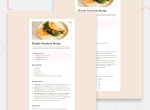
Design comparison
Solution retrospective
I am proud of my html structure - it may not be the best, but I tried to keep it as organized as was within my ability. Next time, I would structure my site out sooner, so as to keep the css cleaner.
Also, I used rem instead of px for my scaling. :)
What challenges did you encounter, and how did you overcome them?Styling both list bullet points, as well as tables, was relatively new to me. I just haven't had the need to style them leading up to this project. Thankfully, with the help of Google, it was pretty simple to figure out.
Also had a fun moment with the card width not filling the screen on mobile ratios. Turned out I was setting the card width in the media query, but was using max-width for the card earlier in the project, which overrode the query. Using max-width for both fixed the issue.
What specific areas of your project would you like help with?My scaling seems to be a bit off... I used a base font size of 16px, and yet it looks smaller than the solution comparison. Any feedback about that would be appreciated!
There are also a couple places where the spacing or font-weights might be off, I plan on going back through at some point to clean that up.
Community feedback
- @DetonatedSkull1722Posted 10 months ago
You website looks good but creating a good clone of a website or an image is a huge task, you did a very good job at that . Improvements you can make are the padding around the list items, it would make it look a lot more professional
Marked as helpful1
Please log in to post a comment
Log in with GitHubJoin our Discord community
Join thousands of Frontend Mentor community members taking the challenges, sharing resources, helping each other, and chatting about all things front-end!
Join our Discord
