Design comparison
Solution retrospective
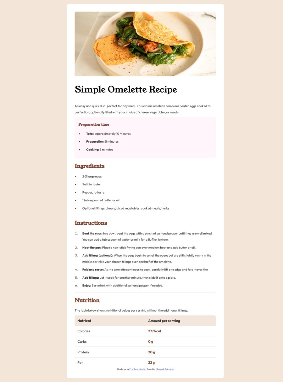
I'm most proud of achieving a clean, responsive design that looks good on both desktop and mobile devices, enhancing user experience. Next time, I would focus more on a mobile-first workflow to ensure the design scales up seamlessly from smaller screens, and I would incorporate more interactive elements, such as step-by-step guides or video tutorials, to make the design more engaging.
What challenges did you encounter, and how did you overcome them?One challenge I encountered was ensuring the layout remained responsive across various screen sizes, especially when switching from desktop to mobile views. I overcame this by using flexible CSS properties like flexbox and media queries to adjust the design elements dynamically. Another challenge was maintaining a consistent style across all sections. I addressed this by defining a clear colour scheme and typography in the CSS, using variables to manage colours and fonts efficiently.
Community feedback
Please log in to post a comment
Log in with GitHubJoin our Discord community
Join thousands of Frontend Mentor community members taking the challenges, sharing resources, helping each other, and chatting about all things front-end!
Join our Discord
