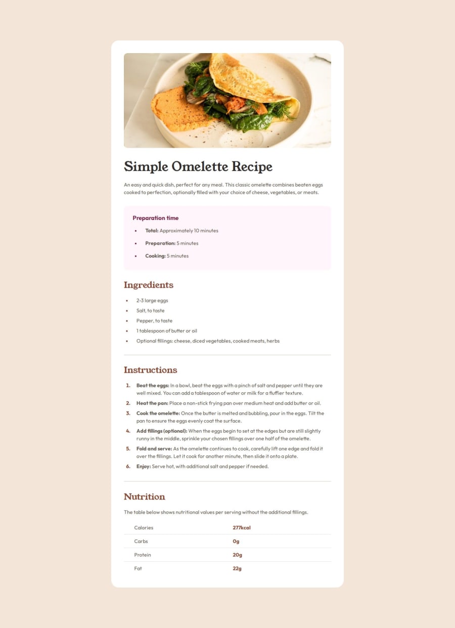
Design comparison
Solution retrospective
I am quite happy with how I structured my html. It was also quite straightforward as I am getting used to structuring when trying to replicate a design.
I am also happy with how I structured my CSS, even though the next step will definitely be to split it in different files! But overall, I am getting a good workflow with it.
What challenges did you encounter, and how did you overcome them?The most challenging part was that I have lost quite some time trying to get this as close as possible to the design, like to the pixel! But in the end I don't know if that it is really necessary... advise needed here :)
Otherwise, I had some difficulties with the styling of the lists.
What specific areas of your project would you like help with?The main area where I would need some help on this challenge is where to stop when replicating a design. I tried to be as close as possible to it but my margins and paddings numbers might not be conventionnaly correct... (2.2rem here, 1.6rem there...).
Please log in to post a comment
Log in with GitHubCommunity feedback
No feedback yet. Be the first to give feedback on Arnaud Lahaut's solution.
Join our Discord community
Join thousands of Frontend Mentor community members taking the challenges, sharing resources, helping each other, and chatting about all things front-end!
Join our Discord
