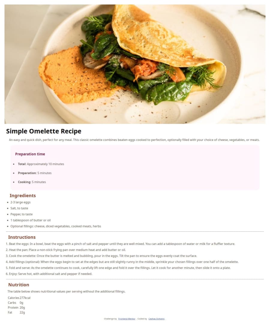
Design comparison
Solution retrospective
I'm proud of my first project with FrontEnd mentor after completing an online self-paced bootcamp. It has provided me with the opportunity to put the diverse skills to practice, thus re-enforcing the knowledge I've been gaining. I have also learnt new concepts such as custom CSS variables and the tag in HTML. I've also learnt to deploy websites on github pages, which is really great for my future career.
What challenges did you encounter, and how did you overcome them?Differentiating the colours to use was an uphill task. Making the page responsive has been a nightmare.
What specific areas of your project would you like help with?The custom fonts in the CSS files do not reflect on the webpage. Please help to figure out why and how to solve it. I understand I can use in HTML, but that is not the approach I'd like to take this time. Making the page responsive has been a nightmare. I can't seem to get past the @media and screen () query. How do I add the background colour for desktop sit and move everything from the screen edge? a general review of my codes including best practices and readability would be highly appreciated
Community feedback
- @StroudyPosted about 2 months ago
Exceptional work! You’re showing great skill here. I’ve got a couple of minor suggestions that could make this stand out even more…
- Overusing
<div>
tags, known as "divitis," leads to cluttered code, poor semantics, and reduced performance. Instead, use appropriate semantic elements (like<header>
,<section>
, etc.) to improve readability, accessibility, and SEO. Keep HTML clean and minimal to ensure maintainability, scalability, and better CSS structure.
<div> <img src="assets/images/image-omelette.jpeg" alt="close up shot of an omelette with fillings" /> </div>
-
Using
font-display: swap
in your@font-face
rule improves performance by showing fallback text until the custom font loads, preventing a blank screen (flash of invisible text). The downside is a brief flash when the font switches, but it’s usually better than waiting for text to appear. -
Using a full modern CSS reset is beneficial because it removes default browser styling, creating a consistent starting point for your design across all browsers. It helps avoid unexpected layout issues and makes your styles more predictable, ensuring a uniform appearance on different devices and platforms, check out this site for a Full modern reset
-
Line height is usually unitless to scale proportionally with the font size, keeping text readable across different devices. Best practice is to use a unitless value like
1.5
for flexibility. Avoid using fixed units likepx
or%
, as they don't adapt well to changes in font size or layout. -
I think you can benefit from using a naming convention like BEM (Block, Element, Modifier) is beneficial because it makes your CSS more organized, readable, and easier to maintain. BEM helps you clearly understand the purpose of each class, avoid naming conflicts, and create reusable components, leading to a more scalable codebase. For more details BEM,
I hope you’re finding this guidance useful! Keep refining your skills and tackling new challenges with confidence. You’re making great progress—stay motivated and keep coding with enthusiasm! 💻
0 - Overusing
- @svetikbaihePosted about 2 months ago
Hi there!
First of all, congratulations on your first project here!
Not an expert, just a toddler in front-end ;) I came across your project today and decided to share some thoughts, maybe you can use it for your next practice.
As for your work overall, you handled it quite well. Great job!
There are some aspects that might be changed. The first thing that caught my eye is HTML structure. I guess, it's one of the most important things that should be honed first among other things at the beginning of your path as a developer. Consider adding divs where necessary so you can easily style your elements. If you add a wrapper to your header and main section, you will be able to move your content away from the edges and add the needed background to your body. Another option instead of styling the body directly is to add another div and apply styles to it.
Pay attention to design details such as the border-radius on images, margins, and paddings.
Talking about responsiveness, mobile-first workflow is definitely worth looking into. It's easy to work with and helps you to scale your project from small devices to big ones.
Regarding font sizes, I noticed you're using a comma instead of a semicolon, which can lead to a syntax error.
Also, I recommend working with README and markdown from the start as well. It can be useful in your future career. It would be great if you replaced the default template of README with your own description of the project. And the last thing, comments and other notes should be removed from the project.
Hope it will be useful for you. Good luck!
0
Please log in to post a comment
Log in with GitHubJoin our Discord community
Join thousands of Frontend Mentor community members taking the challenges, sharing resources, helping each other, and chatting about all things front-end!
Join our Discord