

Design comparison

Solution retrospective
I'm most proud of being able to come up with a clean design that is also responsive. The site is able to change cleanly between the mobile version and the web version, and I think the breakpoint that I used works well to transition between the two. One thing that I would improve upon for my next project, is making my code more responsive so that I don't have to make my media queries so long.
What challenges did you encounter, and how did you overcome them?One challenge that I came upon was finding a good breakpoint for my media queries. Throughout my coding process I also learned that it is best to only define the size of the main container, and to leave any other content container's width and height to auto so that they adjust based off of the size of the main container as well as the contents that they will be holding. This makes it easier to media query later on, since the other containers won't be overflowing/remaining too small.
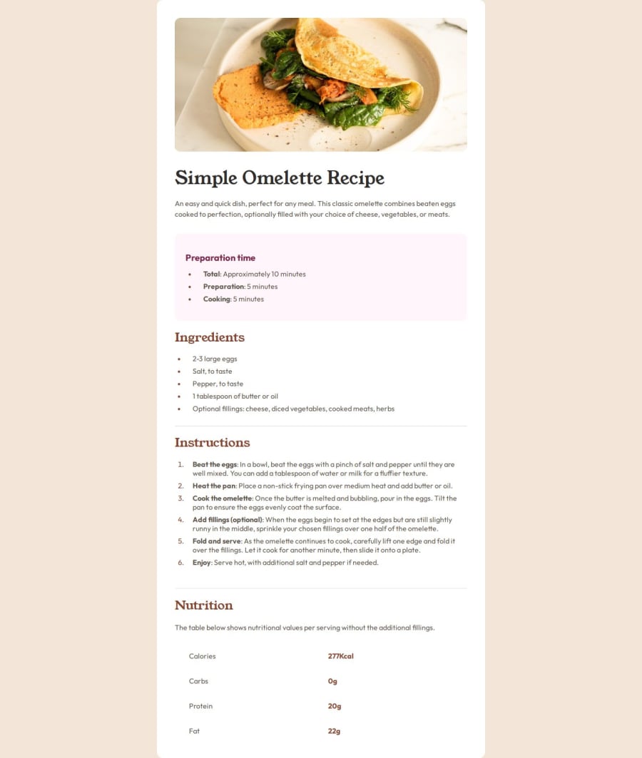
Another challenge that I came across was figuring out the best way to make the nutrition table. I first tried with the HTML table element, but I felt that it wasn't the best solution. I later decided to use display grid and set up the rows and columns based off of the table contents.
What specific areas of your project would you like help with?The area that I would like help with, which is something that I ended up excluding from this project, would be how to incorporate those horizontal lines that are in the nutrition table. I tried to do an HTML <hr> but since I used display grid it would turn that horizontal line into a vertical line. I'm not sure if adding an entire row into my grid template for the horizontal line would be the solution, or if there is an altogether better way of doing this instead of display grid.
Please log in to post a comment
Log in with GitHubCommunity feedback
- @paulemileatn
Hi Joel! Great job on this challenge.
I checked your code, especially the part you struggled with. I think using display grid here is a bit overkill. It would have been easier to use display flex for each row of the nutrition info and add the small border with border-bottom.

Join our Discord community
Join thousands of Frontend Mentor community members taking the challenges, sharing resources, helping each other, and chatting about all things front-end!
Join our Discord