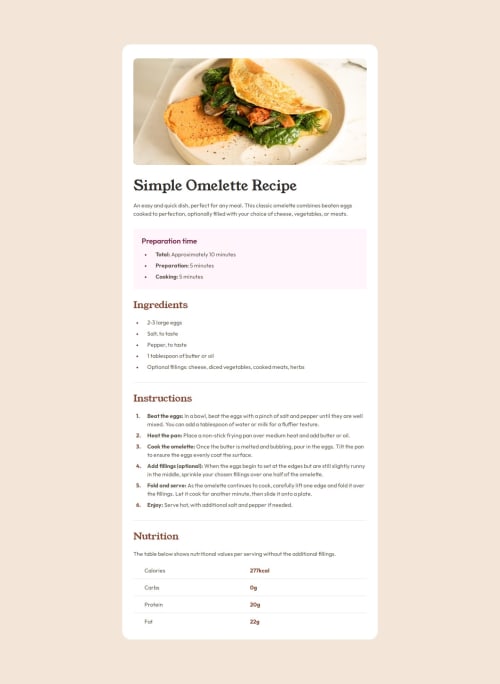
Design comparison
Solution retrospective
I learnt how to create "custom" list "bullets". I don't know why, but the "::marker" selector didn't work to create space between the bullet and the content of the "li", that's why I created a custom list style.
What challenges did you encounter, and how did you overcome them?Spacing the bullets in the lists was difficult. in the last section of the page, the "nutrition" table/grid, I used "li" to create the horizontal lines that separates the text content rows, I feel that there's a better way to do it, maybe using ::after/::before.
Community feedback
- @StroudyPosted 2 months ago
Awesome job tackling this challenge! You’re doing amazing, and I wanted to share a couple of suggestions that might help refine your approach…
-
You have a few
width
inpx
but some inrem
, Inconsistency, -
Your heading elements are
<h1><h3><h2>
, Heading elements should be in sequentially-descending order (e.g.,<h1>
,<h2>
,<h3>
) to create a clear content structure, improving accessibility and SEO. Skipping levels or using them out of order can confuse screen readers, affect search engine rankings, and make your content harder to understand. -
I think you can benefit from using a naming convention like BEM (Block, Element, Modifier) is beneficial because it makes your CSS more organized, readable, and easier to maintain. BEM helps you clearly understand the purpose of each class, avoid naming conflicts, and create reusable components, leading to a more scalable codebase. For more details BEM,
-
Maby explore downloading the fonts and add them to your CSS with
@font-face
, Downloading fonts and using@font-face
in CSS is beneficial because it improves performance by reducing external requests, provides better control over font styling, and ensures consistent rendering across different browsers and devices.
You’re doing fantastic! I hope these tips help you as you continue your coding journey. Stay curious and keep experimenting—every challenge is an opportunity to learn. Have fun, and keep coding with confidence! 🌟
Marked as helpful0 -
- @MikDra1Posted 2 months ago
Well done, here are some things to review:
-
Your use of the
:root
selector to define global styles like font-family and color scheme is excellent for maintaining consistency. However, thecolor: rgba(255, 255, 255, 0.87);
might reduce readability on lighter backgrounds. Make sure to check the contrast, especially in light mode. -
The hover effect on
a
tags adds a nice interactive feel, but you might want to ensure the color transition is smooth by addingtransition: color 0.3s;
. This will give users a more polished experience. -
The
body
setup withdisplay: flex; place-items: center;
is a good way to center content, but you could run into issues with vertically centering on smaller screens. Consider addingjustify-content: center;
as well. -
For accessibility, using
outline: 4px auto -webkit-focus-ring-color;
on buttons is great for keyboard navigation, but ensure it's clearly visible in both light and dark modes. -
The
logo
hover effect is a fun touch. Just watch out for performance issues withwill-change: filter;
since it can be resource-intensive on lower-end devices.
Hope you found this comment helpful 💗💗💗
Good job and keep going 😁😊😉
1 -
Please log in to post a comment
Log in with GitHubJoin our Discord community
Join thousands of Frontend Mentor community members taking the challenges, sharing resources, helping each other, and chatting about all things front-end!
Join our Discord