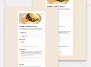
Design comparison
SolutionDesign
Community feedback
- @grace-snowPosted 26 days ago
This doesn’t really look close enough to the design yet. Try and get the font styles and all styling much closer.
In the html I notice some important changes are needed:
- headings must go in hierarchical order and not skip levels. This is a valuable accessibility consideration.
- bold text for emphasis is done with strong not spans.
- the table must use header cells for header content.
- those header cells should also have a
scopeattribute to make clear they are row headers not column headers.
And in css
- get into the habit of including a full modern css reset at the start of the styles in every project you do. Andy Bell or Josh Comeau both have good ones you could use.
- place font-face declarations before where you use them in the css.
- make sure you include fallback fonts
- I’m not sure you mean to be using rem for so many inline paddings and margins. Make sure you’re only using that for properties that you’d want to scale with the user's font size.
- similarly, you’re using em units a lot which is unexpected and could lead to unwanted results. Only use em on specific properties where you want it to scale with the current element’s font size. For example, button padding is commonly done with em or vertical margins above headings and paragraphs. It’s usually only used quite rarely.
- the max width on the main component should definitely be in rem. That’s a width that needs to scale with the users font size.
- Personally I would style the white box as a component inside the main landmark instead of making it be the main landmark. This is because on a real site there may be pages where the main wouldn’t have a limited width and style like this.
- there needs to be a media query in this challenge. Currently it looks broken viewed on my mobile. Everything is aligned over to the side and the table lines overflow the main landmark. Make sure you check all screen sizes as well as changing browser font size and zooming in/out to cover everything.
- the line heights look too large on the main heading and there are inconsistencies in font size.
Marked as helpful2@Najiyyah05Posted 24 days ago@grace-snow Thank you Grace. I'd work on the correction you pointed out
0@Najiyyah05Posted 16 days ago@grace-snow I already made the corrections. Thank you Regarding the strong tag for bolding, I thought span will be a good idea so I can just give all of them same properties.Or is there any other way to do that
0@grace-snowPosted 7 days ago@Najiyyah05 Span is a meaningless element. Strong is the element for bold emphasis which is what this is.
Marked as helpful1
Please log in to post a comment
Log in with GitHubJoin our Discord community
Join thousands of Frontend Mentor community members taking the challenges, sharing resources, helping each other, and chatting about all things front-end!
Join our Discord
