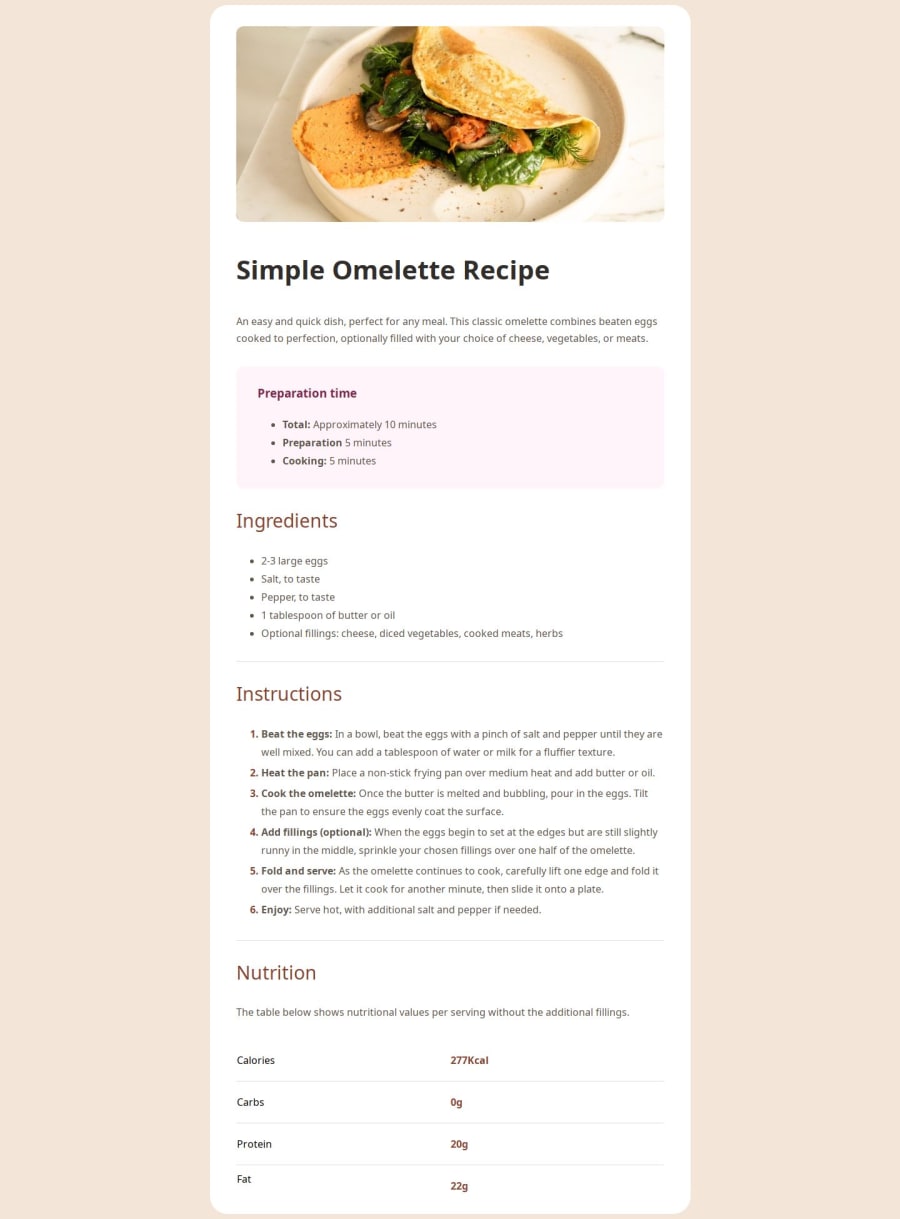
Design comparison
Solution retrospective
- First major learning
If you want to target the bullet points or simply the numbers in CSS, you can do that with pseudo-code as described here:
("li::marker")
.content ol li::marker { color: red; }
Super cool!! :D
- You can target the last child of a table with this pseudo-code:
"tr:last-child"
css tr:last-child { border-bottom: none; }
What specific areas of your project would you like help with?I couldn't reduce the border-bottoms of the table rows using right margin in the media query. So, I made them red instead. Does anyone have an idea how to fix this?
Community feedback
- @sukrut57Posted 6 months ago
this looks great but also look into the mobile version. The view is slightly different compared to desktop version.
0
Please log in to post a comment
Log in with GitHubJoin our Discord community
Join thousands of Frontend Mentor community members taking the challenges, sharing resources, helping each other, and chatting about all things front-end!
Join our Discord
