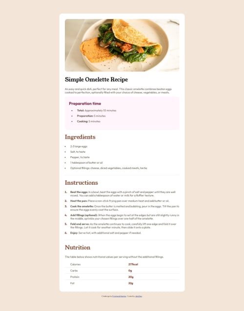
Solution retrospective
Getting a pretty good handle on most of the main CSS for styling. Also starting to get used to Astro, even though I skipped the best practices for it in this challenge :p
What challenges did you encounter, and how did you overcome them?Had a bit of trouble finding the best way to increase the indentation between a bullet point and the bullet point content. Looking online, it was interesting to see how the approach to this has changed over the years in CSS. Something that has existed for a long time in programs like MS Word seemed to have so many approaches in CSS
Also having a difficult time matching font sizes and margin when using the desktop and mobile images included in the design, so decided to leave them as is for now
What specific areas of your project would you like help with?One thing I am interested in knowing is...
If we turned the recipe page into more of a web app, where users can upload their own Recipes, how would you structure the data? In Astro, it looks like we could pull the Markdown or HTML representation of the recipe, and apply some rendering on top of it. However, I am curious to hear what type of data structure would be used to force a clean consistent structure between recipes.
e.g.
recipe: {
  title: string,
  description: string,
  preptime: string, // expect markdown and apply the purple styling on here
  ingredients: string,
  instruction: string,
  nutrition: array
Would this be on the right track? Is it over engineered? Any feedback would be appreciated! Thanks
Please log in to post a comment
Log in with GitHubCommunity feedback
No feedback yet. Be the first to give feedback on JdccDev's solution.
Join our Discord community
Join thousands of Frontend Mentor community members taking the challenges, sharing resources, helping each other, and chatting about all things front-end!
Join our Discord