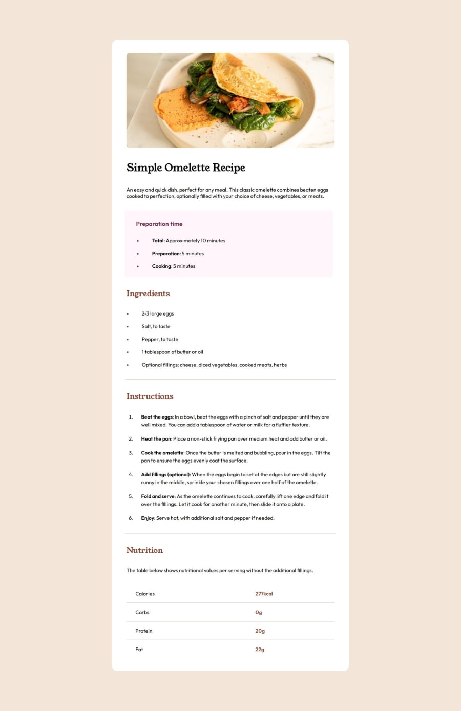
Design comparison
Solution retrospective
I'm proud of just being able to complete my solution and getting it to look as close as possible to the original.
What challenges did you encounter, and how did you overcome them?Some challenges included just researching the right elements to be used for specific sections of the page. This included the use of and lots of elements. Another big challenge that I had to deal with was the horizontal scroll on mobile screen sizes. The best I could up with was reducing font size, adjusting padding and margin, and using an *{} selector for each media query. I'm not too confident in my solution though.
What specific areas of your project would you like help with?I would like help in dealing with the horizontal scroll that occured on mobile devices. What kind of paddings and margins should I implement in the desktop first? Then, when using media queries, how should I style them to prevent horizontal scroll?
Community feedback
Please log in to post a comment
Log in with GitHubJoin our Discord community
Join thousands of Frontend Mentor community members taking the challenges, sharing resources, helping each other, and chatting about all things front-end!
Join our Discord
