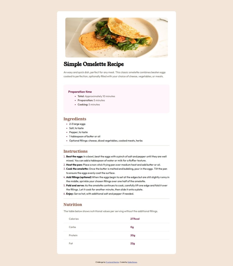
Design comparison
Solution retrospective
I'm proud that I'm getting more comfortable and better with using HTML and CSS.
What challenges did you encounter, and how did you overcome them?A challenge that I encounter while working on this project is creating the table that is in the Nutritional Facts section of the recipe page. I overcame this challenge by doing tons of research until I found out about the :last-of-type
pseudo-class from mdn web docs.
I can't think of any specific areas of this project that I would like help with.
Community feedback
- @SabineEmdenPosted about 2 months ago
Hi there! 👋 Good job on completing the challenge.
The solution includes semantic HTML elements. It’s accessible. The layout looks good on a variety of screen sizes. The code is well structured, with exception of the
<main>
element, and readable. The solution differs from the design in only a few minor points.I don’t have any experience with SCSS and can’t comment on your use of it.
The biggest issue I see is the placement of the
<main>
element. Its opening tag is on line 26 under the<img>
tag and inside<div class=“container”>
. The<div>
is closed on line 122 below the closing for the<table>
element. The closing tag for the<main>
element is on line 132 between the closing tags for the<footer>
and<body>
elements. The browser corrects that and treats<main>
as a child of<div class=“container”>
.Take a look at the MDN documentation for the main element. It represents the main content area of a document. In my opinion, the whole
<div class=“container”>
belongs inside<main>
.Here are a few more suggestions how you could improve your code:
- Using an
<h3>
element for the heading Preparation time skips a heading level. The heading is one level below<h1>
and therefore should be an<h2>
. Use a class to style it differently than the other two<h2>
elements. - To match the design more closely, change the text color for the list items under Ingredients and Instructions.
- Take a look at the placement of the list markers for all three lists and try to match the design in your solution.
I hope this helps. Let me know if you have any questions.
Happy coding! 😎
1 - Using an
Please log in to post a comment
Log in with GitHubJoin our Discord community
Join thousands of Frontend Mentor community members taking the challenges, sharing resources, helping each other, and chatting about all things front-end!
Join our Discord