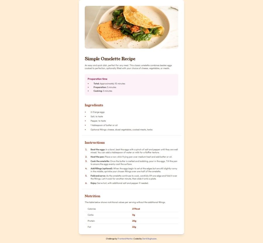
Recipe Page: HTML, Tailwind CSS, CSS Grid
Design comparison
Solution retrospective
I'm proud to have grasped the usage of Tailwind so quickly and am impressed at their documentation and how easy it was to lookup syntax solutions. What I would do differently next time is study layouts a bit more so the concept really sinks in.
What challenges did you encounter, and how did you overcome them?Some challenges I encountered were styling the decimal/disc bullet points without styling the text in the element, styling the image so the padding and rounded border radius were removed on smaller screens and solving the tailwind grid for the Nutrition section. I overcame most of these challenges by reading the Tailwind CSS documentation. I needed to Google a bit for more specific issues like styling the bullets in the ordered and unordered list elements.
What specific areas of your project would you like help with?I wasn't sure if the article, at 100% window zoom, was supposed to be positioned with a top and bottom margin or if the margin need only to persist when the screen view was shrunk, to say, 75% zoom. Needless to say, I had trouble centering the article as a whole at 100% window focal view.
Community feedback
- @Tonyac-createPosted 7 months ago
For semantic, a main content with sections and articles.
1
Please log in to post a comment
Log in with GitHubJoin our Discord community
Join thousands of Frontend Mentor community members taking the challenges, sharing resources, helping each other, and chatting about all things front-end!
Join our Discord
