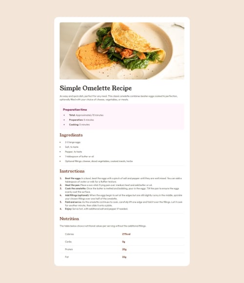
Recipe page [HTML + CSS + Vite + Tailwind CSS]

Solution retrospective
I'm proud of successfully experimenting with grid layout to center the main card in the viewport with top and bottom margins when in Desktop, and disabling all margins in mobile, using only grid layout and media queries.
What challenges did you encounter, and how did you overcome them?The most challenging part has been finding a way to shift to the right not only the text of the elements, but also the bullet. If I simply add a padding left on the, the text is spaced from the bullet but the bullet remains in its original position.
To solve it, I had to add the left padding to the entire or, nothing changes.
I would like to know if there's a better way to left-align the list indicators to the text of the paragraph above, without resorting to manually add left padding to the entire list element.
Please log in to post a comment
Log in with GitHubCommunity feedback
No feedback yet. Be the first to give feedback on Riccardo Bellini's solution.
Join our Discord community
Join thousands of Frontend Mentor community members taking the challenges, sharing resources, helping each other, and chatting about all things front-end!
Join our Discord