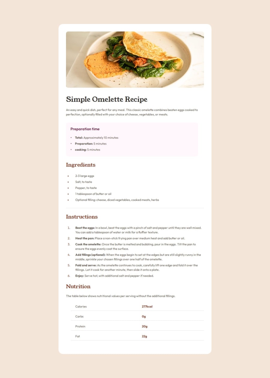
Design comparison
SolutionDesign
Solution retrospective
What are you most proud of, and what would you do differently next time?
I’m starting to use CSS selectors in a better way than I did before, so I can read my code more easily. Instead of rushing through the code, next time I’ll take more time to think about how I approach the project.
What challenges did you encounter, and how did you overcome them?I was using list-style : inside to make the bullet inside my div but the text on the was wrapping under the bullet and not the text himself, so i didnt use the list style and use padding instead
What specific areas of your project would you like help with?The approch on the project , how to code it properly and easy for people to read on my code after my work
Community feedback
Please log in to post a comment
Log in with GitHubJoin our Discord community
Join thousands of Frontend Mentor community members taking the challenges, sharing resources, helping each other, and chatting about all things front-end!
Join our Discord
