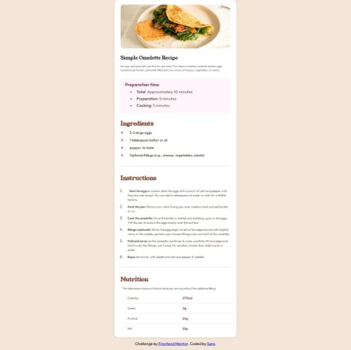
Design comparison
Solution retrospective
-
For doing what I love the most Developing something and making my path of dev skills consistently
-
developing my code skills further
- It was an excellent challenge and I wrote more code than previous challenges but I dint face serious challenge
- As I said before the areas I would like to make more in developing my frontend skills is the Responsive part
Community feedback
- @kareemsakrPosted 9 days ago
You’ve used <div class="container" role="main" id="Home">. While this is fine for a container, consider replacing it with a <main> element since it’s wrapping the main content of the page.
There’s an unnecessary . Remove it as there’s no opening s where possible. For example:
Recipe Image: Consider wrapping the recipe image in a <figure> and adding a <figcaption> if you want to provide an additional caption.
<figure class="recipe-img"> <img src="assets/images/image-omelette.jpeg" alt="A delicious omelette on a plate"> </figure> Ingredients: Use <section> instead of <div class="recipe-ingredients"> for semantic clarity. Instructions: Replace <div class="Instructions"> with <section> as well. Preparation Time and Nutrition: These could also use <section> instead of <div> to enhance readability and accessibility.0@kareemsakrPosted 7 days ago@saruuja My pleasure, feel free to reach out if you need any support
0
Please log in to post a comment
Log in with GitHubJoin our Discord community
Join thousands of Frontend Mentor community members taking the challenges, sharing resources, helping each other, and chatting about all things front-end!
Join our Discord