Design comparison
Community feedback
- @MiyaoCatPosted 10 months ago
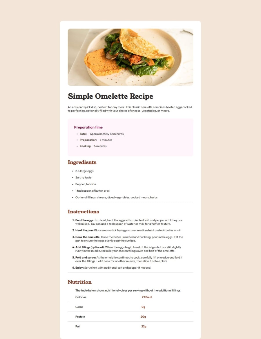
Looks great! There's a couple small details that a slightly different. In the solution page, all of the
<li>'s are aligned with the sub-headers (instructions, ingredients, etc). Your<li>s are indented. It takes some playing around with to get that to align. I just added a 1em margin-left to mine to get it to align.In the nutrition area I recommend using grid or
table/tr/tdelements. I went with table (which I think may be outdated, but I felt this was a good use case for it). That way the content will align better. Also, I noticed you used a div to create the lines. With the table you can use aborder-topinstead.Here's my solution for reference if you want to inspect.
Otherwise, your page looks nearly identical!
Marked as helpful1
Please log in to post a comment
Log in with GitHubJoin our Discord community
Join thousands of Frontend Mentor community members taking the challenges, sharing resources, helping each other, and chatting about all things front-end!
Join our Discord
