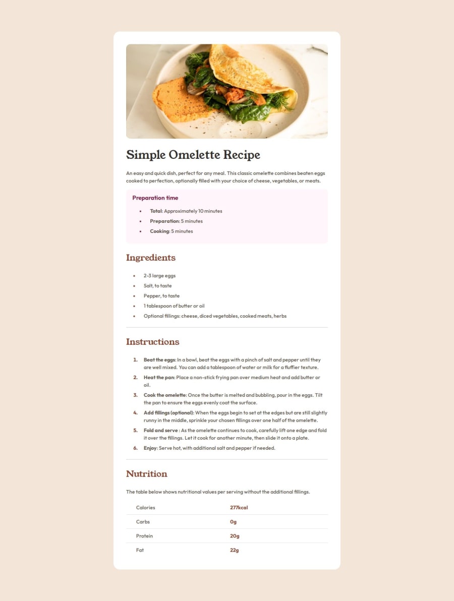
Recipe Page designed with Basic Html and Css
Design comparison
Solution retrospective
I am most proud of using list and table for first time in my design. Next time I will try to design responsive design for example all elements will change size little bit to fit the device size and align uniformly.
What challenges did you encounter, and how did you overcome them?I had a problem in aligning text inside the table. I overcome this by using individual padding and using width property in table data.
What specific areas of your project would you like help with?I want to know how to reduce space before the list marker and how to center the marker between two lines if the list item span to two lines,
Community feedback
- P@law973Posted 6 months ago
Hey! The solution and design look close, which is superb. Judging by that and the areas you would like help with, I would say you have an attention to detail.
To reduce space before the ordered list marker, use "padding-left: 0px" on the ol element, which will shift the list over to the left. From there, play with the value of "padding-left" until you have the desired spacing (perhaps there's a better way, but that's how I did it).
To center the marker between two lines if the list item span to two lines, try using Flexbox (changing the display type removes the default bullet, and Flex allows you to center things) and a custom bullet point that's inserted using "::before". Here's what I did for that:
/* Removes default bullet points and vertically centers the custom bullet points */
ul li {
    align-items: center;
    display: flex;
}

/* General styling for custom bullet point of unordered lists */
ul li::before {
    color: var(--brown-800);
    content: "\2022";
    margin-right: 24px;
}
/* Note: "\2022" is the unicode character for a bullet */
A couple more things worth pointing out:
-
Header tags are more for content that will be used across multiple pages of a site (like a navigation bar that appears on every page, for example). The omelette image and hero section are specific to this recipe and card, so they, along with the "card__container" div, should go inside the main tag. (I am realizing as I type this that my own solution looks horrendous in this regard; it wasn't too long ago, but I have learned a lot thanks to the other contributors here.)
-
Use an h2 for the "Preparation time" text instead of h3; using an h3 would make sense if it was a heading that indicated a subsection within a section that already had an h2 (it's best to avoid skipping heading numbers if you can). The text for the new h2 can be resized if needed via CSS.
-
The omelette image looks fine on the desktop sizing and at 375px, but anything between those two sizes and it gets quite stretched, which is not good. Try out "max-width: 100%" or "object-fit: cover" for situations like this.
-
The usage of the hr tag seems appropriate (I haven't used them much personally), though I would try to style them to match the look of the border lines in the table in regards to thickness and color (it's clearer on zooming in that they have a different appearance). Try "border-width: 0" and "height: 1px".
-
I would remove the attribution styling inside the head and the "attribution" div if it's not going to be used.
Outside of that, I think you've done some great work here.
(Thank you for reading all of this.)
Marked as helpful1 -
Please log in to post a comment
Log in with GitHubJoin our Discord community
Join thousands of Frontend Mentor community members taking the challenges, sharing resources, helping each other, and chatting about all things front-end!
Join our Discord
