Design comparison
Solution retrospective
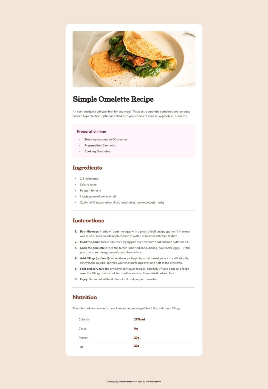
I learn a lot about listand table and I'm really happy to discover new way of thinking, thanks to css counter and pseudoclass ::marker.
Table is not really easy to build and to style. I don't know but for me, I think it's a little bit old fashion… It take to much effort for a basic result.
What specific areas of your project would you like help with?Is there an ohter way to build the table with simplicity?
Community feedback
- @kulalaxPosted 9 months ago
overall a good solution. but keep an eye on the headings font-weight. it looks like its just a regular or even less font-weight
0
Please log in to post a comment
Log in with GitHubJoin our Discord community
Join thousands of Frontend Mentor community members taking the challenges, sharing resources, helping each other, and chatting about all things front-end!
Join our Discord
