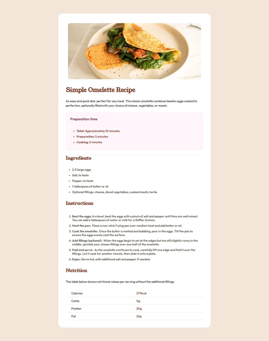
Design comparison
SolutionDesign
Solution retrospective
What are you most proud of, and what would you do differently next time?
Im proud that i am slowly figuring out how to use flex and columns and rows better. x vs y axis on the page.
What challenges did you encounter, and how did you overcome them?Figuring out how to make it into a card with correct proportions, and reading the figma file.
What specific areas of your project would you like help with?Is there anything i can improve on, such as less code with better CSS? Maybe better options in my HTML tags. Open to suggestions and explanations.
Community feedback
Please log in to post a comment
Log in with GitHubJoin our Discord community
Join thousands of Frontend Mentor community members taking the challenges, sharing resources, helping each other, and chatting about all things front-end!
Join our Discord
