Design comparison
Solution retrospective
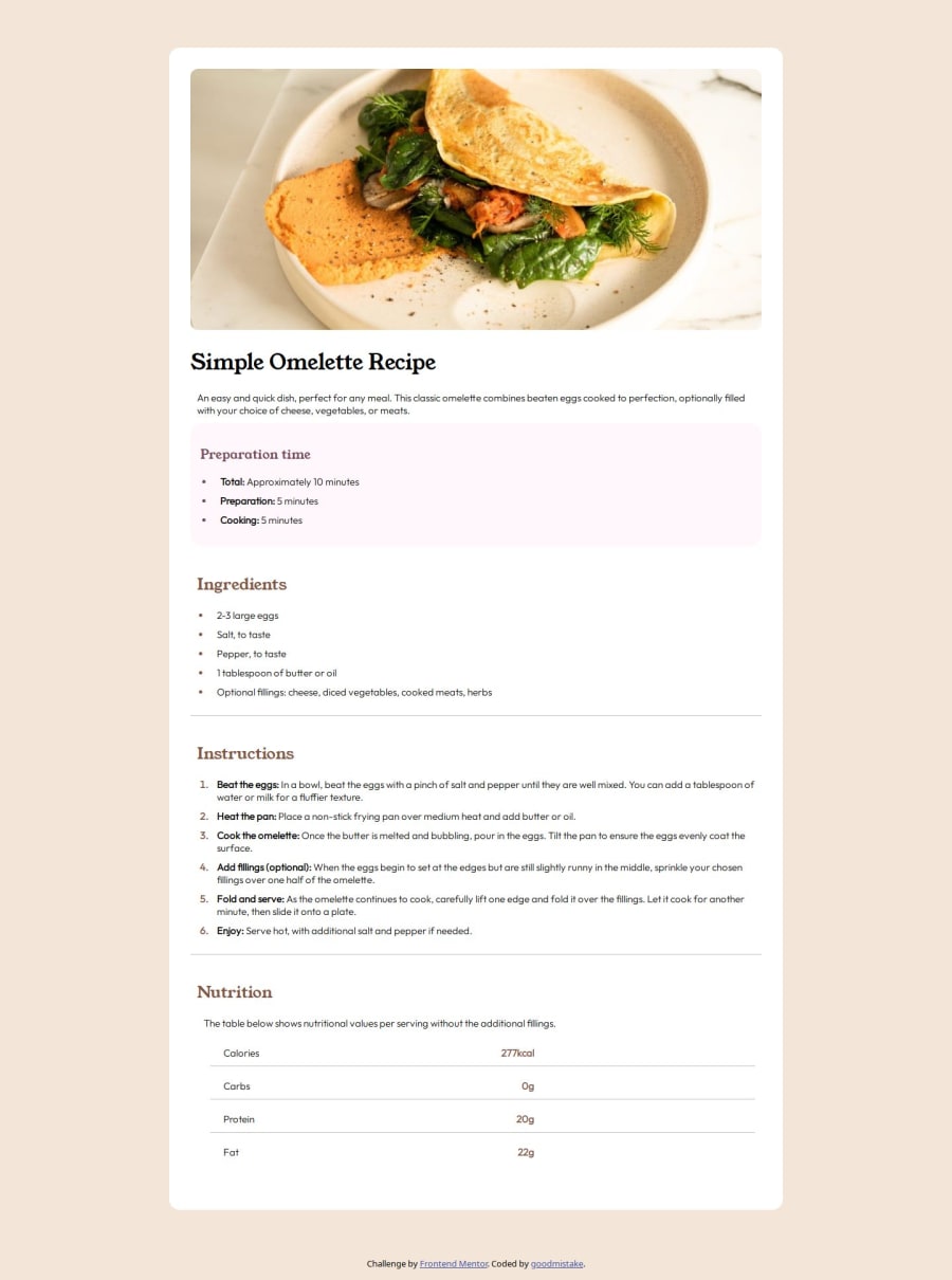
Hello everyone In this challenge I tried to do more semantic html. Any feedback on this code is appreciated.
Community feedback
- @solvmanPosted 9 months ago
Hi @good-mistake 👋
Very well done 🤩 Congratulations 🎉
Great job using
<main>,<header>, and<section>👍. One may view the recipe as part of another bigger page with its header, footer, and side section. There is a slightly better way to semantically denote the recipe rather than using the<main>element. The <article> element represents a complete and self-contained piece of reusable content, such as a newspaper article, forum post, blog post, or recipe. 👌You may wrap the recipe card with the <article> element. For example:<body> <main> <article class="main-container"> <header> <img .../> <h1>Simple Omelette Recipe<h1> <p>...</p> </header> <section> <h2>Ingredients</h2> ... </section> <section> <h2>Instructions</h2> ... </section> <section> <h2>Nutrition</h2> ... </section> </article> </main> </body>Otherwise, your typography, colors, and white spacing are on point 👌. I'd also like to compliment you on your excellent page responsiveness. 🙌 Overall, it is a very well-done project! Congratulations! 🎊 I hope you find my comments useful 🫶
1 - @YemilR10sPosted 9 months ago
¡Está bien! Las medidas hazlas un poco más pequeñas para que pueda quedar igual
1
Please log in to post a comment
Log in with GitHubJoin our Discord community
Join thousands of Frontend Mentor community members taking the challenges, sharing resources, helping each other, and chatting about all things front-end!
Join our Discord
