Design comparison
Community feedback
- @LonlysoftPosted 6 months ago
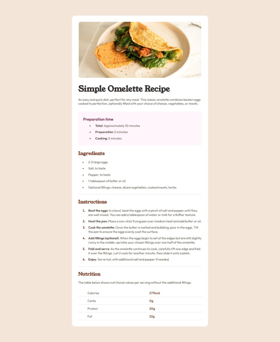
Good looking! The only thing that I think it misses is that in the mobile the image has the padding so it doesn't have a effect that looks like a banner. My recommendation is to divide the image from the rest of the text and in the
@mediaadding a padding to this division and turning therecipe-page's padding 0. Also, the font is already bold by default, so just dim the font-weight in the headings to 400 or tovar(--fw0-light)this will look closer to the design and you'll still have the headings' properties.0
Please log in to post a comment
Log in with GitHubJoin our Discord community
Join thousands of Frontend Mentor community members taking the challenges, sharing resources, helping each other, and chatting about all things front-end!
Join our Discord
