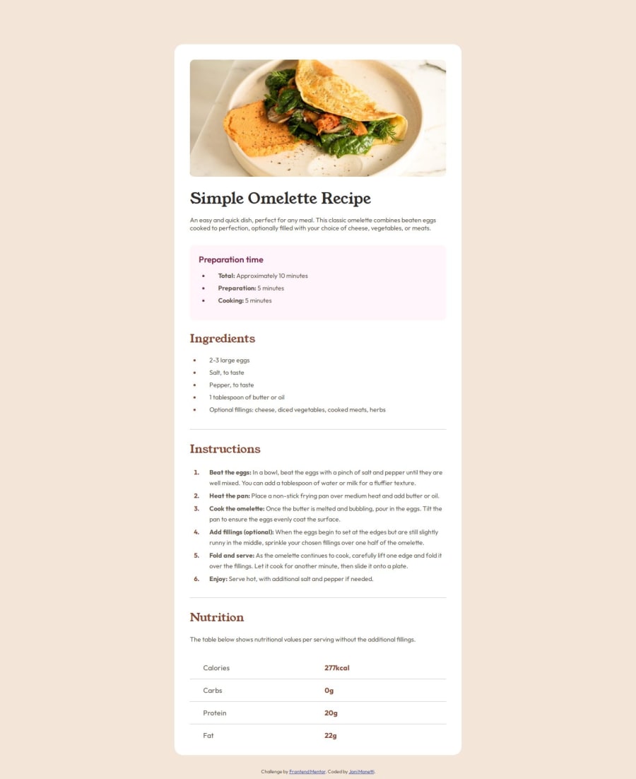
Design comparison
Solution retrospective
The thing I liked most about this project was having to learn new topics, like styling tables with CSS, in order to replicate the design accurately.
What challenges did you encounter, and how did you overcome them?The most challenging part was styling the table at the bottom of the page. I had to use chatgpt and youtube tutorials in order to do it. Also i had some troubles with the hr label, i never used it before this.
What specific areas of your project would you like help with?I would like some help or tips about styling tables, some tricks or ways to do it better or more efficiently next time.
Community feedback
- @Alex-Archer-IPosted 11 months ago
Hi! Good work! Well done with using semantic elements =)
Well, <hr> is basically an element with just borders. So you can stylize it via borders rules. Or you can just apply
border-bottomfor the sections to achieve similar effect.As for tables - sorry, can't said much about them. They are used less often now - mostly for e-mail markup. Maybe this article would be helpful: https://css-tricks.com/complete-guide-table-element/
Good luck!
Marked as helpful0
Please log in to post a comment
Log in with GitHubJoin our Discord community
Join thousands of Frontend Mentor community members taking the challenges, sharing resources, helping each other, and chatting about all things front-end!
Join our Discord
