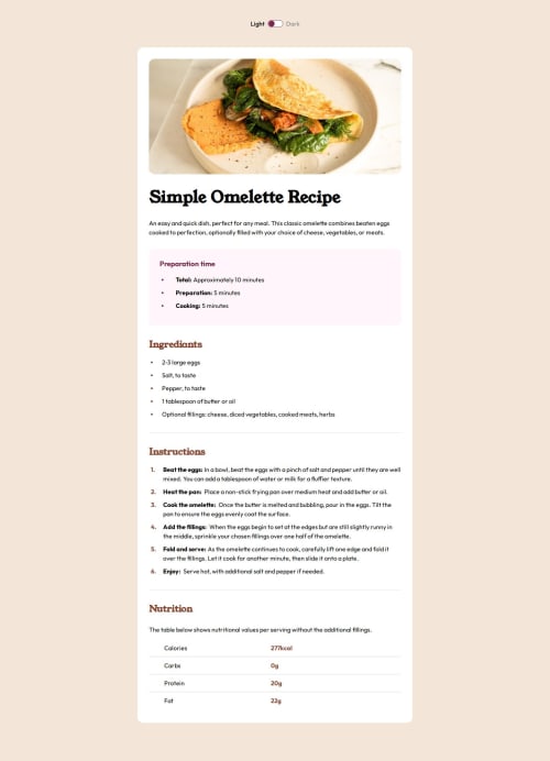
Recipe page created using React with dark theme

Solution retrospective
Added the dark theme in the project. It took some time for to do this but worth it. I will try to add dark theme in every project to see how it looks in both light and dark.
What challenges did you encounter, and how did you overcome them?Main challenge was to make bullet points in ul > li elements to have the color and also some distance apart from the main content. Also for the ol > li, counting the items in the ol is a new thing i learned and giving them some coloring with the same distance between main content.
What specific areas of your project would you like help with?I am still new to the responsive layout but I am quickly learning and would take much less time in future.
Please log in to post a comment
Log in with GitHubCommunity feedback
No feedback yet. Be the first to give feedback on Nikhil Bhaladhare's solution.
Join our Discord community
Join thousands of Frontend Mentor community members taking the challenges, sharing resources, helping each other, and chatting about all things front-end!
Join our Discord