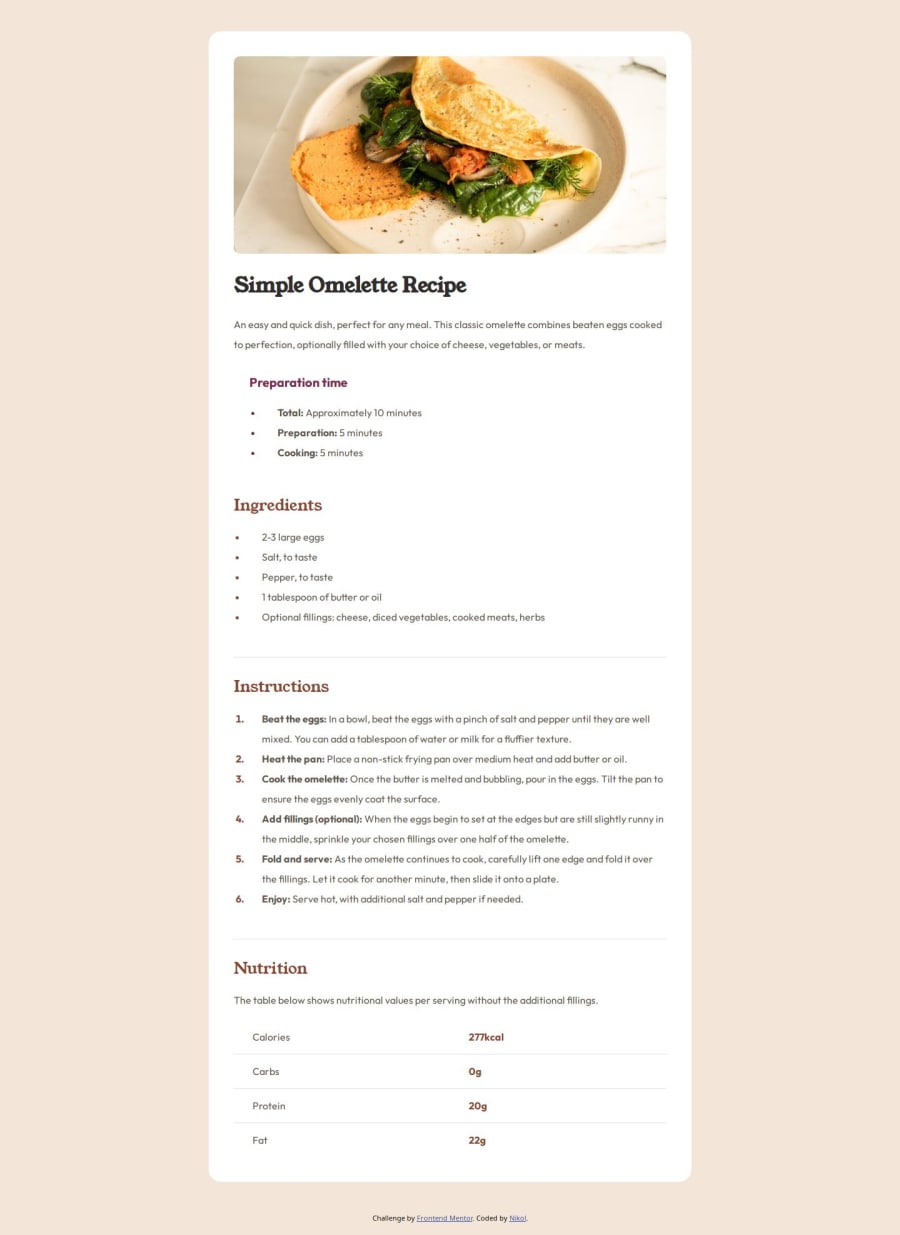
Design comparison
Community feedback
- @Si1entERAPosted 8 months ago
Hello @nikol-zimova
Congratulations on the completion of your project.
Your project looks solid and all that's needed is some fine-tuning.
You should try "semantic HTML tags" which can help organize your webpage into meaningful sections making it more readable, maintainable whiles giving you more control on the layout and is also good for SEO. You can replace "<div>" with "<section>" or "<article>"
The way you centered your div is solid, but it's always good to have more than one option to center a div. Below uses flex.
body{ display: flex; justify-content: center; align-item: center; min-height: 100vh; }
I hope you find this helpful, good luck on your journey.
Happy Coding.
Marked as helpful1@nikol-zimovaPosted 8 months agoHI @Si1entERA, thank you for the encouraging and helpful comment! I definitely need to check out the semantic HTML tags. Every day I learn something new. :) Happy coding!
0
Please log in to post a comment
Log in with GitHubJoin our Discord community
Join thousands of Frontend Mentor community members taking the challenges, sharing resources, helping each other, and chatting about all things front-end!
Join our Discord
