

Design comparison

Solution retrospective
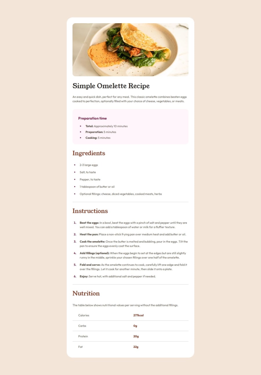
One thing I noticed a lot of people were doing was sticking with the generic ul li causing the marker of the li to not be centered. I used a content of a circle and the absolutely positioned it to be lowered like in the image. This actually took a while to figure out since I was not sure if it was possible with just the marker itself.
What challenges did you encounter, and how did you overcome them?Mostly the positioning of the ul li marker to be centered on the multiple line li in mobile versions. Method mentioned in the most proud area.
What specific areas of your project would you like help with?I would like to point out that one issue I had is exact sizing for everything. Not sure if that comes with the figma file via premium account but I do tend to eyeball as best as possible and use the supplied image as reference. Hence the slightly thinner and longer look. However I think this makes it a bit more a challenge at times to see how well someone can replicate based off the smallest information available.
Please log in to post a comment
Log in with GitHubCommunity feedback
No feedback yet. Be the first to give feedback on Andrew Neely's solution.
Join our Discord community
Join thousands of Frontend Mentor community members taking the challenges, sharing resources, helping each other, and chatting about all things front-end!
Join our Discord