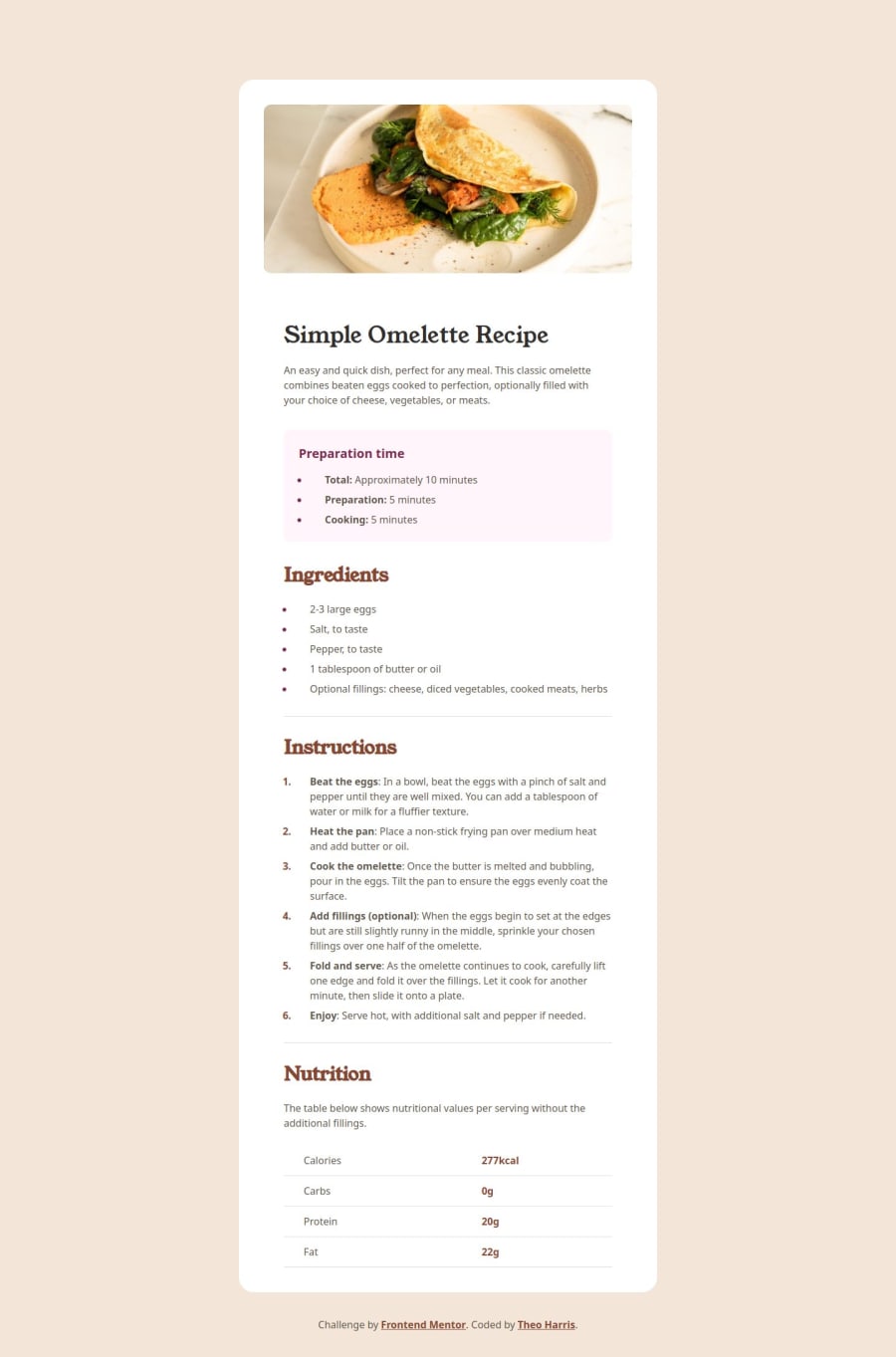
Recipe Page Challenge


Design comparison

Solution retrospective
I'm pretty happy with this solution overall. I think the responsiveness is pretty spot on, and I'm happy with how I handled the changing layout of the image on mobile versus desktop.
Next time I'll be double checking the figma a lot more closely now that I have pro, as some of the actual font sizes in design seemed to differ from those in the style guide.
What challenges did you encounter, and how did you overcome them?I initially wasn't sure how to style the list markers independently of the text inside a list item, but doing some research online was able to find out that there is a pseudoselector for this, li::marker
If you have any suggestions for how I could improve my tailwind config for readability or better developer experience, let me know! This is something I'm still getting a feel for.
Community feedback
- @asanalievPosted 2 months ago
Hi Theo,
The tab "Why this is an issue" on the issue page contains tips with code examples:
(1) No issue will be raised on <table> used for layout purpose, i.e. when it contains a role attribute set to
presentationornone.<table role="presentation"> <tr> ... </tr> </table>(2) No issue will be raised on <table> containing an
aria-hiddenattribute set totrue.<table aria-hidden="true">Regarding
alt. Redundant because words "image" or "photo" inaltwouldn't add any value to the description, since the screen reader does that forimgtag already. A quote from the rule (from "Why this is an issue" tab):If the alt attribute includes words like "image", "picture", or "photo", it leads to redundancy as the screen reader would repeat "image". For instance, an alt attribute like "image of a sunrise" would be read as "Image, image of a sunrise", unnecessarily repeating "image".
If accessibility of interfaces is important, I would not suggest leaving
altempty.Hope that helps, Askat
0 - @asanalievPosted 2 months ago
Hi Theo,
Great job!
I checked your solution on PulseLet (web app testing service), and don't see any issues with responsive design. Good quality done!
But there are some issues in the code. For example: redundant alternate description for image, missing <th> for table (important for accessibility!), duplicate selectors in css.
Details can be found here: https://pulselet.com/projects/108.
Cheers, Askat
0P@Theosaurus-RexPosted 2 months ago@asanaliev thank you for the feedback - since the design does not have headers for the table columns, what would you suggest instead?
Also, could you please elaborate on why the alt text is redundant here? I did consider leaving the alt attribute blank and treating it as purely decorative, but not sure of the rationale
0

Please log in to post a comment
Log in with GitHubJoin our Discord community
Join thousands of Frontend Mentor community members taking the challenges, sharing resources, helping each other, and chatting about all things front-end!
Join our Discord