

Design comparison

Solution retrospective
I'm just glad I could do it in the first place. Mostly. What I would do differently next time is to figure out the order of steps first. Write the most basic few codes, copy the text, separate the text, etc. Just slowly building it up as opposed to being all over the place a bit and jumping back and forth.
What challenges did you encounter, and how did you overcome them?It's a first time for me so pretty much everything was a challenge in one way or an other but determination and looking up stuff (and some tears) slowly helped me get through.
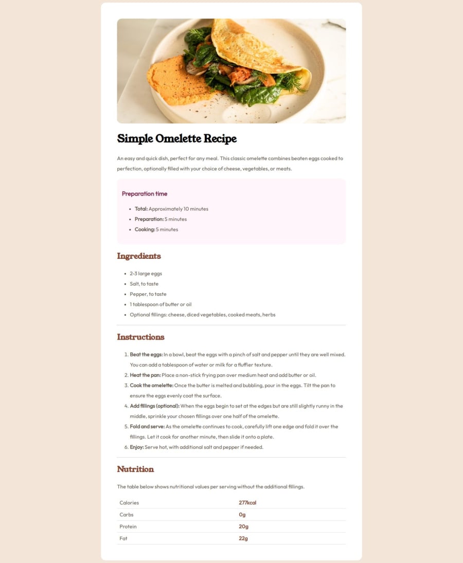
What specific areas of your project would you like help with?One thing I sure missed is that the numbers in the numbered list have a different style compared to the rest of the text. I have found examples of how it could be done but they seemed way too complicated and I didn't really understand them. To me it seems like everything else is mostly fine but I'm curious if there are any solutions to this.
Community feedback
- @leonp84Posted about 1 year ago
Looks very good. I also struggled quite a bit with this one. They seem easy at first glance, but a thousand little things pop up once you start the design :)
To colour the number of the numbered lists:
ol > li::marker { color: hsl(14, 45%, 36%); font-weight: bold; }And to create distance between the numbers and the text:
ol > li { padding: 0 20px; }Marked as helpful1

Please log in to post a comment
Log in with GitHubJoin our Discord community
Join thousands of Frontend Mentor community members taking the challenges, sharing resources, helping each other, and chatting about all things front-end!
Join our Discord