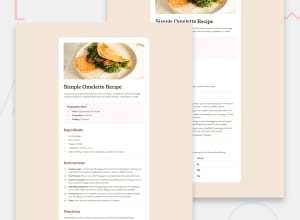
Design comparison
SolutionDesign
Solution retrospective
What are you most proud of, and what would you do differently next time?
- use nesting css.
- as soon as simple style.
Community feedback
- @Carson-HaskellPosted 4 months ago
Nice job!! I am especially impressed with your CSS. I totally forgot you could nest CSS like that! Also great job using more responsive units like
remandem. I still struggle with using those overpx!Minor
- Check padding (card needs more padding around the edges, table rows need more padding, instruction steps need more padding between each other)
- Card needs to be wider, it feels a bit skinny
- Overall, because the lack of padding and it being too skinny, it feels a little cluttered, and therefore a little less elegant and professional compared to the design
Very minor
- if you wanted to be more semantic, you could use
<section></section>tags instead of<div></div>to distinguish between your different "sections" (preparation, ingredients, instructions, nutrition).
0
Please log in to post a comment
Log in with GitHubJoin our Discord community
Join thousands of Frontend Mentor community members taking the challenges, sharing resources, helping each other, and chatting about all things front-end!
Join our Discord
