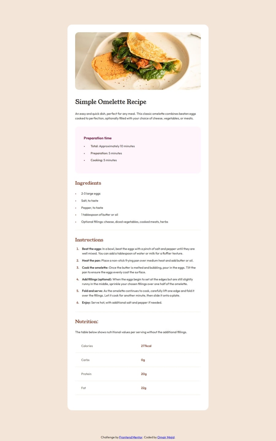
Design comparison
Solution retrospective
Despite this project being a bit more challenging than the other projects, I'm incredibly proud of how closely I matched the design. Next time, I would do something differently: give more thought to the layout and how to achieve the correct spacing.
What challenges did you encounter, and how did you overcome them?The biggest challenge was styling the bullet points and adding spacing before the text. I achieved this with the `` property and setting it to outside.
This allows you to adjust the padding
as needed.
Any feedback on best practices and responsive design is greatly appreciated.
Community feedback
- @Jo-with-visionPosted 5 months ago
Hi,
The finished design looks great with lots of whitespace for readability. You did a great job matching the design (especially if like me you didn't have the Figma design file!) There is extra length on the screenshot because of the extra spacing you have compared to the design, but good work!
HTML
You have used
<main>
and<footer>
which are great semantic elements. However, elsewhere in your HTML, I can see that you are relying heavily on using the<div>
element, which isn't the best practice. Here's some tips:- Consider using
<article>
for the recipe. The<article>
element is for self-contained content that can stand-alone and also be shareable (a recipe page would be a perfect example of this!) - The difference sections of the recipe could be placed in
<section>
tags. - If you use a CSS reset which includes setting images to
display: block
there would be no need to wrap images inside a div. You can give the image a class name directly for any additional styling. - Consider changing your
<span>
to<strong>
as the beginning words are important parts of the instructions and<strong>
indicates their importance. - Never use a div for a table! There is a
<table>
element for the very purpose of creating tables in HTML, alongside<th>
for table headers and<tr>
for table rows (and much more!)
Please spend some time reading about semantic HTML and correct tags for your content. Remember you don't need to use a <div> when there are better semantic HTML elements available. A good resource is MDN (I will share a couple of links)
MDN Table Basics:
https://developer.mozilla.org/en-US/docs/Learn/HTML/Tables
MDN page structure and Semantic HTML:
CSS
There's lots of great stuff in your css:
- custom properties
- rem units
- A basic reset
- max-width in rem
- Tidy and well organised rulesets
About the list spacing: I just added left padding to my
li
items to create the space, but your approach is very interesting too and something new for me to learn :)Here are some thoughts (I am not a CSS expert so they are only casual observations):
- you shouldn't need to display the recipe as flex for this challenge because its children will naturally flow in a stacked structure anyway, because they are all block level elements (apart from the image, which could be made to be a block element in your reset).
- If you brush up on your HTML tables you can then style its selectors and classes using CSS instead of your current approach - it is actually much simpler when using the correct table HTML because it comes with default table structure!
- I'm not sure your media query needs to change so much! I have seen some comments saying not to use a media query at all for this challenge. I did actually choose to use one on my own project for basic changes.
Happy Coding! Jo
0 - Consider using
Please log in to post a comment
Log in with GitHubJoin our Discord community
Join thousands of Frontend Mentor community members taking the challenges, sharing resources, helping each other, and chatting about all things front-end!
Join our Discord