Design comparison
Solution retrospective
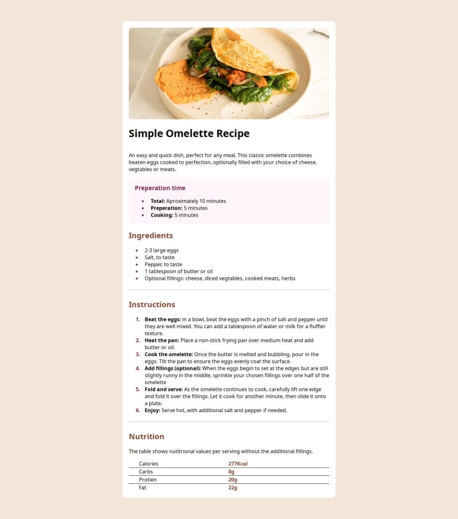
I'm extremely proud that I was able to style the lists. This took some time but in the end I had to go back and insert a lot of span's just so I could colour the bullets but not the text and then bold part of the paragraph but not all of it. I used neovim's amazing macro keys and figured out how they worked.
What challenges did you encounter, and how did you overcome them?This one had a lot of challenges, not least that for some reason my git repo reset itself midway through and I lost half my work, meaning I had to spend a further few hours fixing it.
Other challenges were getting the content to be centred, deciding on a font, spacing and the table at the bottom.
What specific areas of your project would you like help with?I would like help with the units that I used (percentages vh,vw etc) to make sure that i'm using the right units, I would also like to know why I struggled to center the content originally and how to get better at spacing the elements.
Community feedback
- @BolazcodingPosted 3 months ago
Firstly you did great. Your font styles are not applied. Instead you can go to google font and import the font style into your code. It is not bad that you used for vh and vw for the width and height. It is a good practice that you use percentage for width and height and pixels or rem for margins.
Marked as helpful1
Please log in to post a comment
Log in with GitHubJoin our Discord community
Join thousands of Frontend Mentor community members taking the challenges, sharing resources, helping each other, and chatting about all things front-end!
Join our Discord
