Design comparison
SolutionDesign
Solution retrospective
What are you most proud of, and what would you do differently next time?
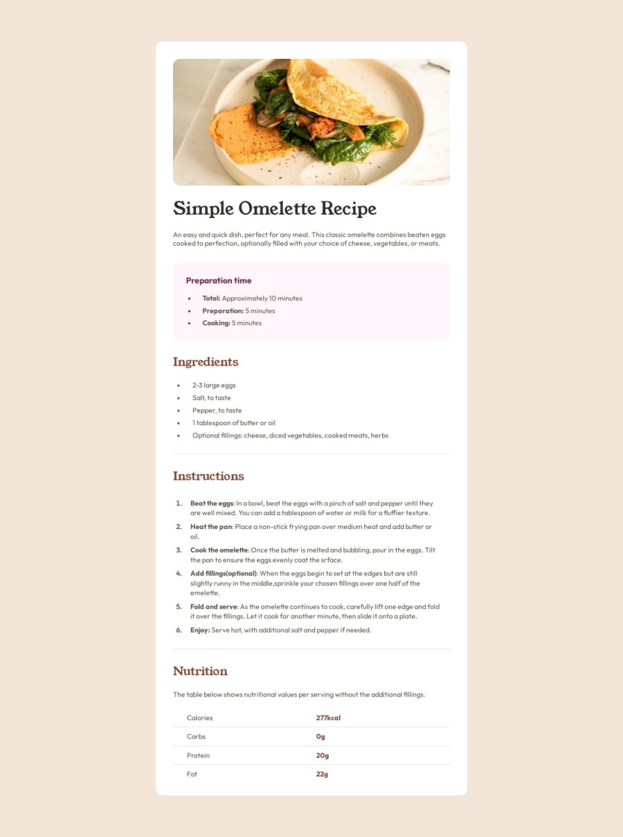
I am proud to make this in less then 2 hours.Was really alot of details to make from design colors etc.Used alot of variables and its really responsive I tested for small phones and look great and very fluid.
What challenges did you encounter, and how did you overcome them?tables was little bit harder because this is first time I used table but managed to figure out in the end how to make borders line the same that is in design
What specific areas of your project would you like help with?Maybe where to find good info/sites/videos for table design other then that I understand everything
Community feedback
Please log in to post a comment
Log in with GitHubJoin our Discord community
Join thousands of Frontend Mentor community members taking the challenges, sharing resources, helping each other, and chatting about all things front-end!
Join our Discord
