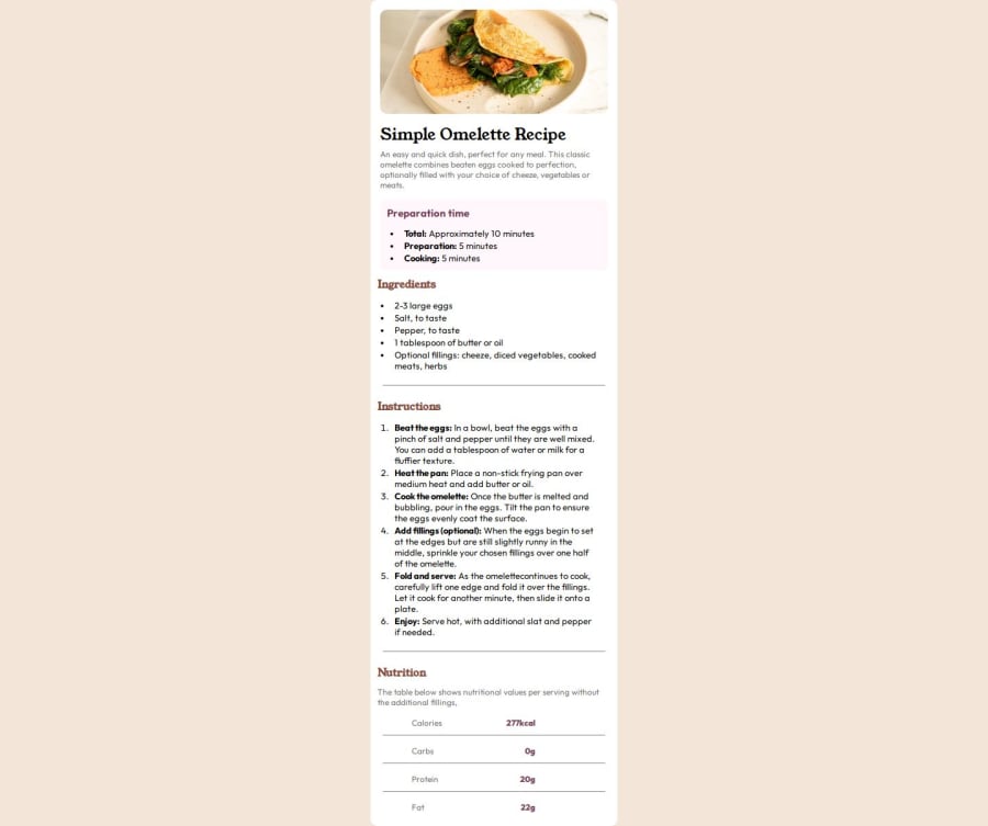
Design comparison
Solution retrospective
Alright, I think I did it just fine.
What challenges did you encounter, and how did you overcome them?color codes and font sizes, I figured it out on my own.
What specific areas of your project would you like help with?how to read font size, weight, family, color codes and all on the figma files that front-end mentor provides.
I am asking it generally, not for this specific challenge. I didn't get any figma file for this one, just an image of the design.
Community feedback
- @Mirjax2000Posted 8 months ago
Figma reading - sometimes the designer will write all color pallete and sizes into specific side, and for there you can read it, or you need to go inside main parrent element , click by mouse and you see all colors and fonts on the right panel, and form there you can paste it in to zour project, or another way how to do it, is if you click on the figma element by right click into context menu you select copy code as css, and there are all information as well, sizes,family,colors,line-heights, etc ...
and back to your code, HTML structure is good, but you overuse DIV elements. We have HTML landmarks. Browser will better know what it is diplaying, and also it has some poitns to SEO evaluation. put main elements into <header> if is it header, <nav> if is it navigation, <main> if is it main content. <article>,<section>,<aside>, use them.
You made only mobile version. If you want to switch to desktop version you need to create break point by mediaquerie and reconfigure changes. theme - responsive design, dynamic content,mediaquries, flexbox,gridbox. you need to discover these.
Marked as helpful0@Wespy07Posted 8 months ago@Mirjax2000 Thanks a lot man, I highly appreciate your feedback here.
Actually the thing is I just wanted to get done with this challenge, I didn't want to spend too much time or energy on it. I am familiar with all the terms that you've suggessted me, but there wasn't any need to make this design responsive. I saw the challenege details and it never mentioned to make it responsive. The images for desktop and phone which I got in the starter kit looked the same.
1
Please log in to post a comment
Log in with GitHubJoin our Discord community
Join thousands of Frontend Mentor community members taking the challenges, sharing resources, helping each other, and chatting about all things front-end!
Join our Discord