Design comparison
Solution retrospective
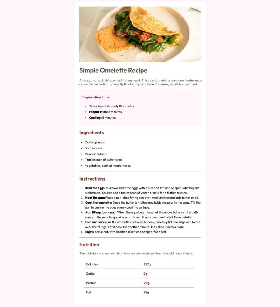
I used the correct dimensions both for the margins and the padding. I need to improve the responsive part
What challenges did you encounter, and how did you overcome them?The final part was difficult for me, especially in creating perfect alignment between the written and numerical values. I couldn't find a better way to build it than with self-imposed margins.
What specific areas of your project would you like help with?The responsive part was the most difficult.
Community feedback
- @HyperShark25Posted 5 months ago
Wonderful, perhaps you would like to have the background color of the body element to be different from the "preparation time" section in order to display multiple set of colors.
0
Please log in to post a comment
Log in with GitHubJoin our Discord community
Join thousands of Frontend Mentor community members taking the challenges, sharing resources, helping each other, and chatting about all things front-end!
Join our Discord
