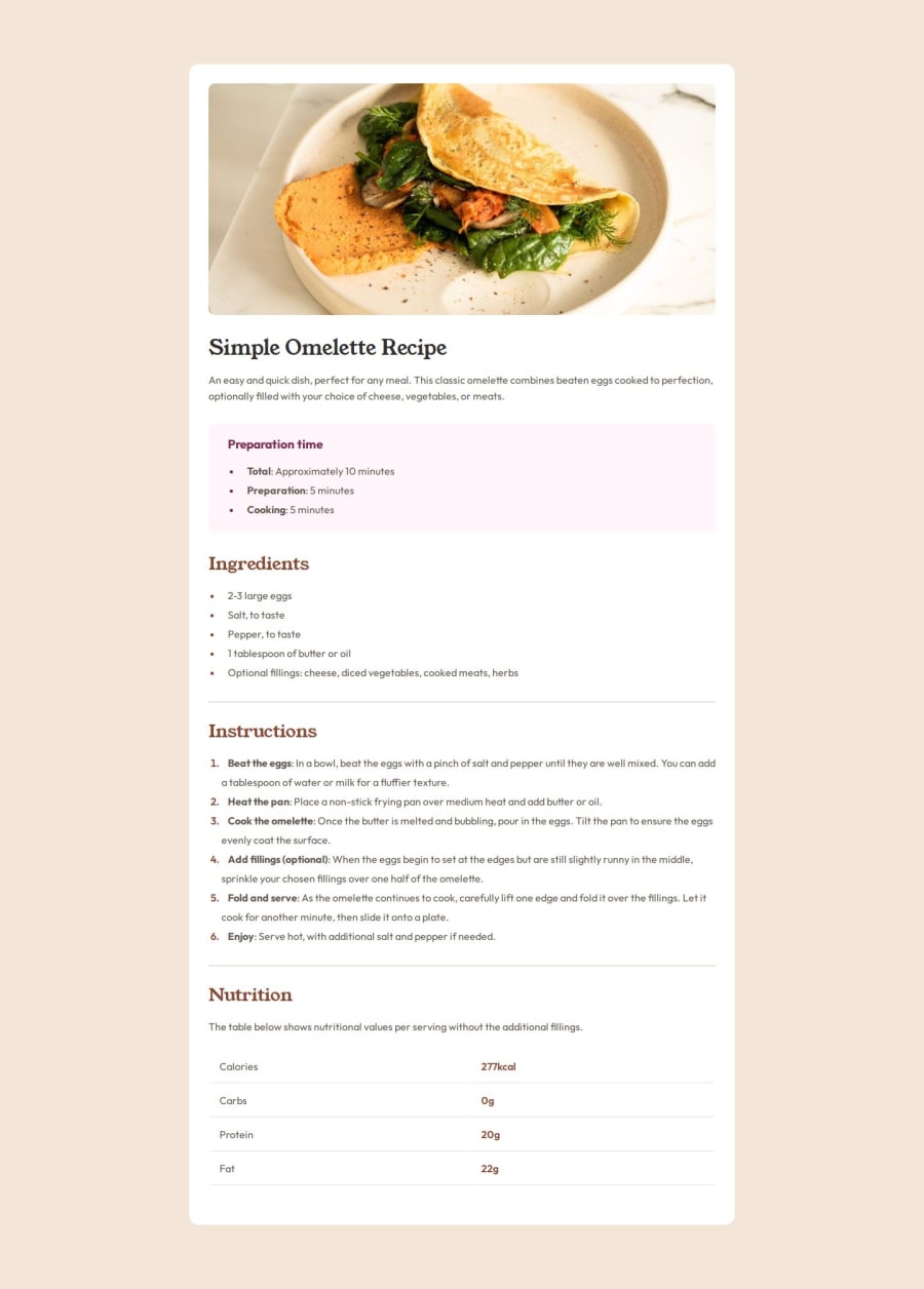
Design comparison
Solution retrospective
I learned how to make use of the CSS custom properties which make it possible for me to easily reuse certain properties of my design. I also learned how to make use of semantic HTML tags in my HTML structure.
In my future implementations i will make use of a CSS framework like bootstrap or tailwindcss to ease the styling of my webpage and possible use build tools as well to minimize files and assets before deploying.
What challenges did you encounter, and how did you overcome them?Getting the accurate dimension of the sections in the design image while designing. I tried mapping the spaces with my eyes and estimating dimensions.
What specific areas of your project would you like help with?The best possible way to make use of fonts in CSS. From importing to assigning it to areas of your webpage design.
Community feedback
- @StroudyPosted 2 months ago
Awesome job tackling this challenge! You’re doing amazing, and I wanted to share a couple of suggestions that might help refine your approach…
-
Your heading elements
<h1><h3><h2>
, Heading elements should be in sequentially-descending order (e.g.,<h1>
,<h2>
,<h3>
) to create a clear content structure, improving accessibility and SEO. Skipping levels or using them out of order can confuse screen readers, affect search engine rankings, and make your content harder to understand. -
I think you can benefit from using a naming convention like BEM (Block, Element, Modifier) is beneficial because it makes your CSS more organized, readable, and easier to maintain. BEM helps you clearly understand the purpose of each class, avoid naming conflicts, and create reusable components, leading to a more scalable codebase. For more details BEM,
-
Using
font-display: swap
in your@font-face
rule improves performance by showing fallback text until the custom font loads, preventing a blank screen (flash of invisible text). The downside is a brief flash when the font switches, but it’s usually better than waiting for text to appear. -
Developers should avoid using pixels (
px
) because they are a fixed size and don't scale well on different devices. Instead, userem
orem
, which are relative units that adjust based on user settings, making your design more flexible, responsive, and accessible. For more information check out this, Why font-size must NEVER be in pixels or this video by Kevin Powell CSS em and rem explained.- Another great resource for px to rem converter. -
Using
max-width: 100%
ormin-width: 100%
is more responsive than justwidth: 100%
because they allow elements to adjust better to different screen sizes. To learn more, check out this article: responsive-meaning. -
Using
rem
orem
units in@media
queries is better thanpx
because they are relative units that adapt to user settings, like their preferred font size. This makes your design more responsive and accessible, ensuring it looks good on different devices and respects user preferences.
I hope you found this advice helpful! Keep up the great work, You’re doing amazing, and I can’t wait to see what you create next. Happy coding! 🚀
0 -
Please log in to post a comment
Log in with GitHubJoin our Discord community
Join thousands of Frontend Mentor community members taking the challenges, sharing resources, helping each other, and chatting about all things front-end!
Join our Discord