Design comparison
Community feedback
- P@MattPahutaPosted 7 months ago
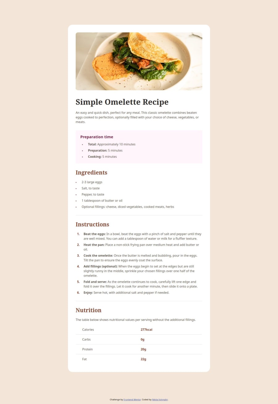
Hey there. Nicely done completing this challenges. Other than a few finer details, your solution is a close match to the design comp. Good use of semantic elements and responsive units for your font sizes as well. Here are a few things I've flagged for you:
- On mobile, the spacing between the image and the heading is a bit off. I think you can remove the margin top from the h1 to remedy that.
- You're missing a border radius on the accent box (prep time).
- Also, there should be a similar border radius applied to the card and the image on larger screens.
- The height and width you have set on the image have no effect and are not necessary.
- Also for the image, the
altattribute should be more descriptive. Image descriptions should not include words like 'image' or 'picture' because they are already an image role. There are good posts in the discord server in resources channel on this topic. - The bolded words in the lists are an appropriate use case for the
strongtag. The spans you're using have no semantic value. Switch them out forstrongtags and save yourself some code in the styles. - You're using a
tableelement for the tabular data so that's great, but your missing header cells. The 'Calories', 'Carbs', 'Protein', and 'Fat' cells should bethelements with the scope attribute set to "row"
Again, great job finishing the challenge! Keep going. Cheers!
Marked as helpful1P@NikitaVologdinPosted 7 months agoThank you, @MattPahuta, for taking the time to review my code and provide feedback. I really appreciate you teaching me some new concepts.
0
Please log in to post a comment
Log in with GitHubJoin our Discord community
Join thousands of Frontend Mentor community members taking the challenges, sharing resources, helping each other, and chatting about all things front-end!
Join our Discord
