Design comparison
SolutionDesign
Community feedback
- @thaArcadeGuyPosted 3 months ago
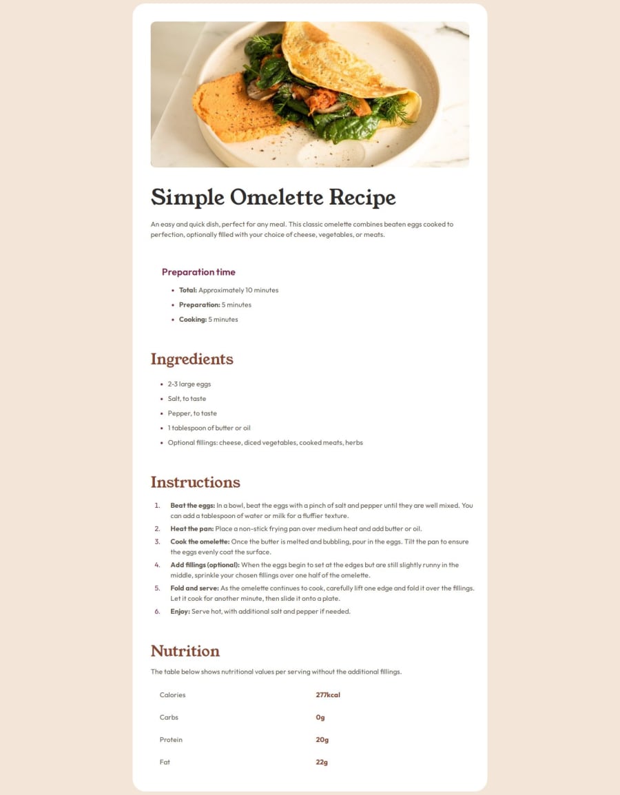
Congratulations upon finishing you solution. So here are a few issues that I think you can work on:
- Add a horizontal line below the ingredients and instructions sections using the
<hr>element in yourindex.htmlfile. - Add border bottom lines using such CSS code:
table { border-collapse: collapse; } tr { border-bottom: 1px solid hsl(30, 18%, 87%); } tr:last-child { border-bottom: 0; }- Style lists by adding space between the list markers and text using such CSS code:
ul, ol { padding-left: 1.25rem; } li { padding-left: 1.125rem; margin-bottom: 0.5rem; } li::marker { color: hsl(332, 51%, 32%); font-weight: 700; }- The other issue is that your solution is not responsive so instead of using
pxuseremoremandpercentagesfor your measurement values. And also do some research on Media Queries.
Let me hope you find this helpfully.
Marked as helpful0 - Add a horizontal line below the ingredients and instructions sections using the
Please log in to post a comment
Log in with GitHubJoin our Discord community
Join thousands of Frontend Mentor community members taking the challenges, sharing resources, helping each other, and chatting about all things front-end!
Join our Discord
