Design comparison
Solution retrospective
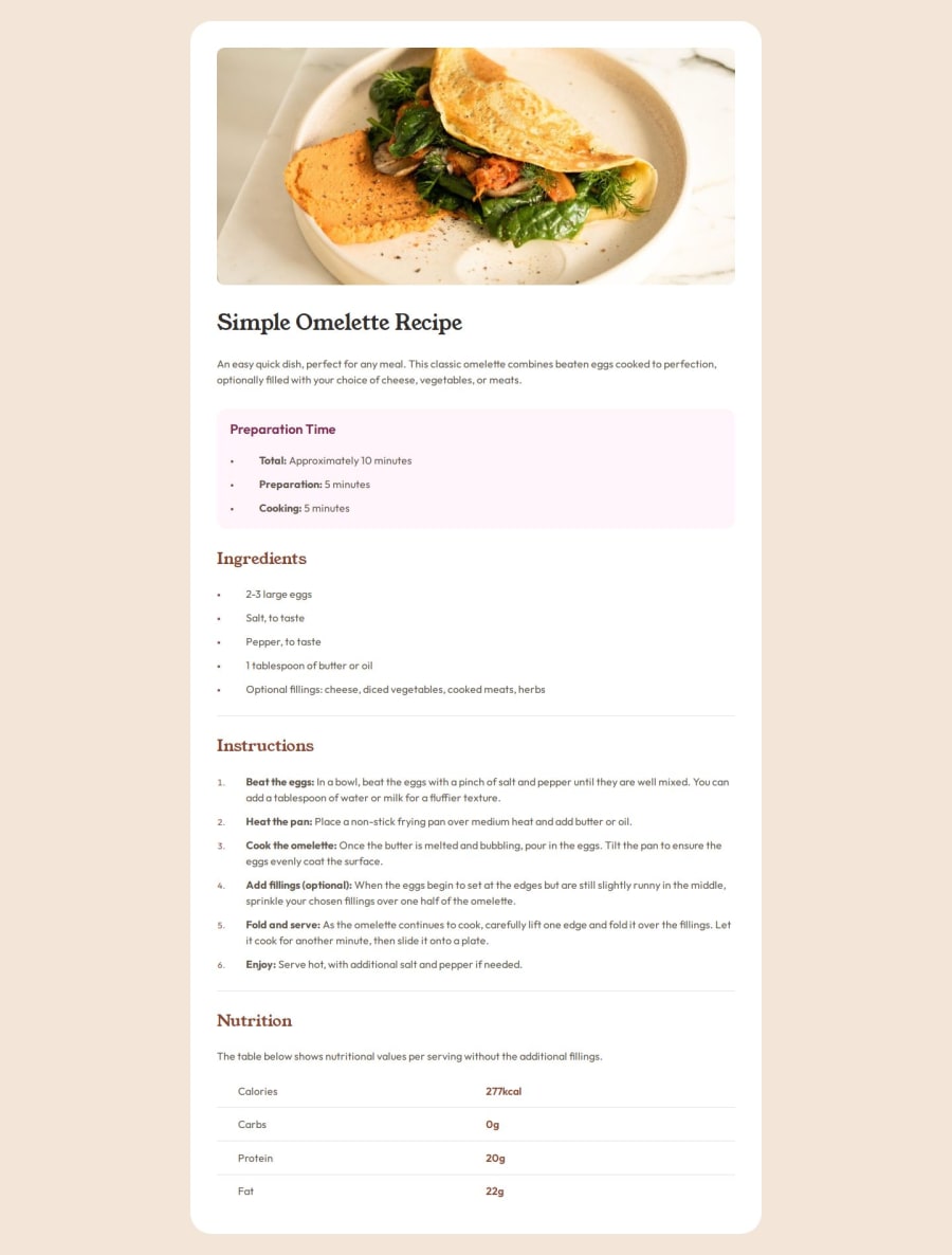
Though I am still a practitioner and need much more practice, I am very proud that I understand each line of HTML and CSS! Something I want to do differently next time is to initially understand and expect what the page will look like on the desktop as well.
What challenges did you encounter, and how did you overcome them?One challenge I encountered was altering the bullet points to a smaller size, and I figured out that by using ::marker and font size, you can alter them however you want!
What specific areas of your project would you like help with?I was unsure if using another div (.recipe) inside another div (.container) is efficient. I initially had issues when using paddings inside the .container div while leaving the image to fit fully inside the container. So, I decided to place another div (.recipe) to make it separate from the image. Later on, using a media query, I placed 0 padding to the div (.recipe) and added the padding to the div (.container). (I hope this makes sense... 🥺)
By learning that trying our best to keep HTML clean at most, I was unsure if using another div (.recipe) inside another div (.container) would be a nice practice.
Community feedback
Please log in to post a comment
Log in with GitHubJoin our Discord community
Join thousands of Frontend Mentor community members taking the challenges, sharing resources, helping each other, and chatting about all things front-end!
Join our Discord
