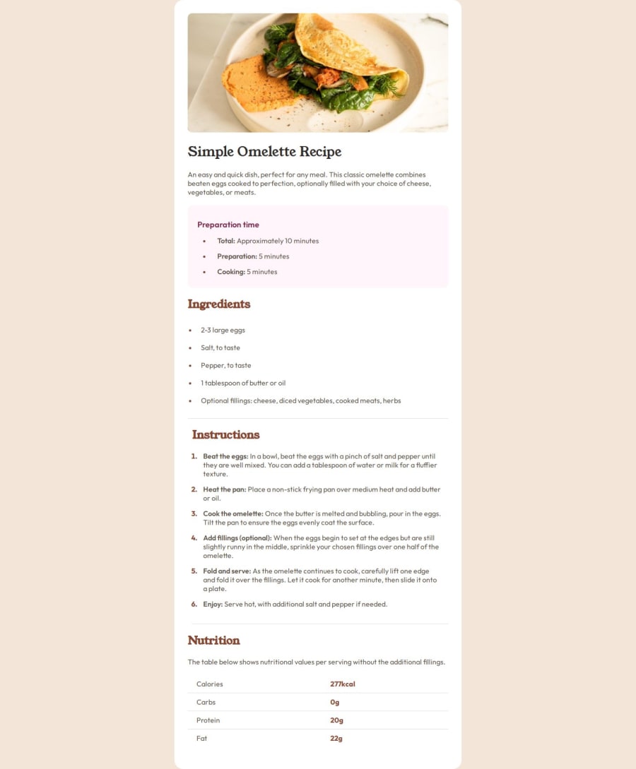
Design comparison
SolutionDesign
Solution retrospective
Looking forward to hear your feedbacks on my code, so i can improve my skills 🤓
Community feedback
- @zacc-anyonaPosted 10 months ago
You did a great job Regina. There is just one flow
- In the mobile design given by frontend mentor the image takes the full screen width of the mobile screen.
- Consider letting the image having
img {
width: 100vw;
}
Marked as helpful1
Please log in to post a comment
Log in with GitHubJoin our Discord community
Join thousands of Frontend Mentor community members taking the challenges, sharing resources, helping each other, and chatting about all things front-end!
Join our Discord
