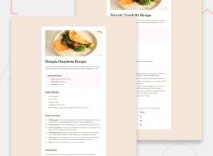
Design comparison
Community feedback
- @MurielM87Posted 4 days ago
you didn't use the right color for the background of the project and the background of the card. This details are very important. Same thing for the color of the titles. The font-size of the paragraphs are too small, and the user can't not read the page easily. Don't hesitate to use line-height also for the paragraphs. This is really too bad but your page is not good. Be careful with the details, small and big, specially with CSS.
0@AbdelrahmanMokademPosted 3 days ago@MurielM87 Thank you for this help. I am very grateful for that. I am now working on the modification to reach the closest possible result
0 - @mrprogrammer1-2Posted 4 days ago
good job it looks great but you need to focus more on which colors you choose otherwise you did great , and welcome to frontend mentor
0@AbdelrahmanMokademPosted 3 days ago@mrprogrammer1-2 Thank you for your beautiful suggestion, my friend. I am now working on modifying the site to achieve the closest possible result
0
Please log in to post a comment
Log in with GitHubJoin our Discord community
Join thousands of Frontend Mentor community members taking the challenges, sharing resources, helping each other, and chatting about all things front-end!
Join our Discord
