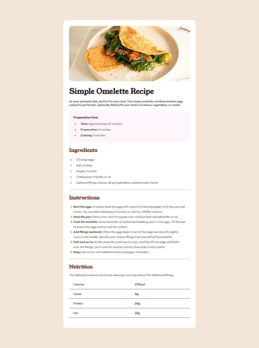


Design comparison

Solution retrospective
I was able to make this one responsive a lot more easily this time with minimal media query usage. Next time I will try to make sure I don't have as many repeating styles, instead I will try and consolidate them into variables whenever possible.
What challenges did you encounter, and how did you overcome them?Once again I found it hard to match mine with the design especially without the figma. I just eyeballed it
What specific areas of your project would you like help with?How do you eyeball the design? I tried using the different weights for my fonts and they still always looked different from the design no matter which one I used. and what about the width and height of the card itself? without figma is there a way to get exact measurements or do I really need figma for that?
in my code do you see anything that can be removed or consolidated? maybe some patterns that I tend to repeat a lot that could be placed into one variable or something? Do you think my code is clean enough or would it be a problem in the field?
Community feedback
Please log in to post a comment
Log in with GitHubJoin our Discord community
Join thousands of Frontend Mentor community members taking the challenges, sharing resources, helping each other, and chatting about all things front-end!
Join our Discord