Design comparison
Solution retrospective
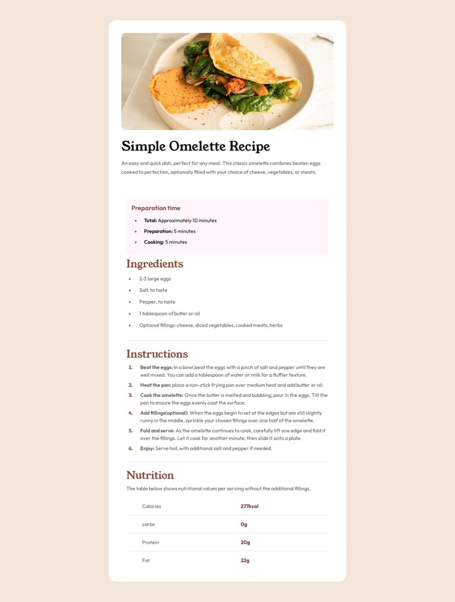
I am very happy that I was able to complete the fourth challenge
What challenges did you encounter, and how did you overcome them?I had challenges with sizing and responsive issues, but by searching, I was able to overcome them
Community feedback
- @JawadM2002Posted 7 months ago
The solution does include semantic HTML, as it shows the emphasis of the elements, for instance, <section> is used for each aspect like ingredients, preparation and nutrition. It is very accessible, with a very good layout for all screen sizes. Furthermore, the code is well structured and readable, with consistent indentation and clear sectioning to define the clear sections, making it easier to read and organise. The use of lists have been used well, as well as relating to each section within the page, as well as meaningful class names that help identify the purpose of each section. Overall, this shows a very great and well structured meaning for semantic HTML and the use of CSS, so very well done and keep up the good work! :)
Marked as helpful0
Please log in to post a comment
Log in with GitHubJoin our Discord community
Join thousands of Frontend Mentor community members taking the challenges, sharing resources, helping each other, and chatting about all things front-end!
Join our Discord
