
Solution retrospective
What are you most proud of, and what would you do differently next time?
I'm proud that I even finished this project, it was the hardest project I've ever done, next time I'd learn how to create tables and properly transfer the design to other screen widths.
What challenges did you encounter, and how did you overcome them?- Lists -- I knew little about them and had to go to YouTube to remember about them
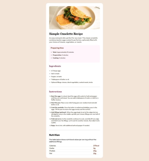
- Tables -- this is probably the hardest thing I've done, since I knew nothing about them, and I had to look at the code of other works to understand how they did it.
- Mobile screen width -- this was very difficult to implement, because I don't have any experience with this, I solved it in a shameful way, namely ChatGPT :( Plus I spent about 6 hours on the project in total, yesterday 5, and today an hour.
In this project I needed help with the bottom table, it was very complicated and I spent about 2 or 3 hours fiddling with it.
Code
Loading...
Please log in to post a comment
Log in with GitHubCommunity feedback
No feedback yet. Be the first to give feedback on Yokene's solution.
Join our Discord community
Join thousands of Frontend Mentor community members taking the challenges, sharing resources, helping each other, and chatting about all things front-end!
Join our Discord