Solution retrospective
I'm glad that I could find a way of deeper stylization elements. It's something new to learn.
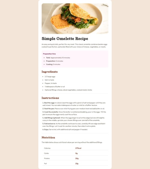
What challenges did you encounter, and how did you overcome them?I stumbled upon an image size in mobile version. It should be stretched to full screen width while the rest of content should keep paddings. I'll find a way - it's a bit clumsy. Maybe I should use slightly different markup at first.
What specific areas of your project would you like help with?I always have troubles with the neat organization. In this project I tried to use BEM. I backed off a little from naming convention - I know - but did I gasp the main idea? Besides any suggestion accepted.
Please log in to post a comment
Log in with GitHubCommunity feedback
No feedback yet. Be the first to give feedback on Alex's solution.
Join our Discord community
Join thousands of Frontend Mentor community members taking the challenges, sharing resources, helping each other, and chatting about all things front-end!
Join our Discord