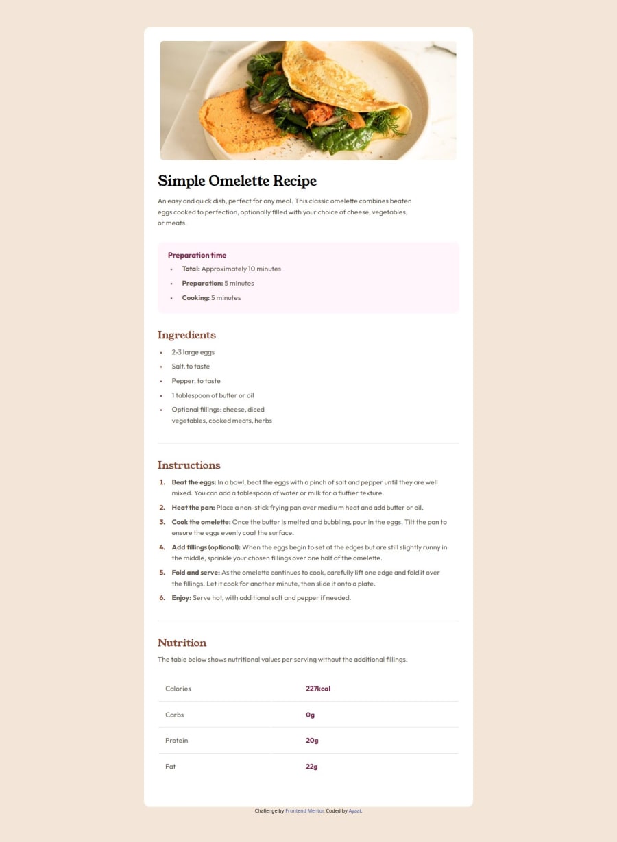


Design comparison

Solution retrospective
I am proud of how I designed the layout and how easy things fell into place because of it. For this challenge, there 2 areas I would like to improve on;
- How I plan the layout from the get go so I don't end up making last minute changes
- write up the media queries a bit differently considering the minimum width condition and the elements to place in them
There were three challenges I encountered in this project;
-
I did not know how to style bullet points or the numbers in html list items, I learnt about the solution watching Kevin Powell's video on how to style html lists using the pseudo-selector '::marker'.
-
The overall layout of the page, considering both the desktop and mobile design and how the elements would scale up and down was a challenge as well as I didn't go through all the elements in detail.
-
Tables were always a quirk for me when it came to laying out content and I was not at ease when I saw it at first, however, learning about the table elements on by one, how they work, what structure to have them in proved useful and relatively easy.
There are a couple of ways I have seen other developers plan their layout and use media queries effectively and so that is an area I could really use help with. Using max-widths and heights for content like the div tags is also an area I need help with.
Please log in to post a comment
Log in with GitHubCommunity feedback
No feedback yet. Be the first to give feedback on Ayaat's solution.
Join our Discord community
Join thousands of Frontend Mentor community members taking the challenges, sharing resources, helping each other, and chatting about all things front-end!
Join our Discord