Design comparison
SolutionDesign
Please log in to post a comment
Log in with GitHubCommunity feedback
- @Manisha3196
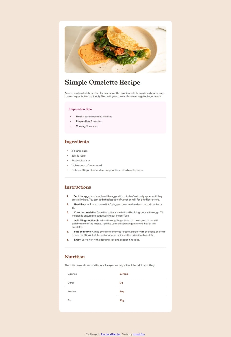
Hi, Your code looks clean and readable.for the line border-bottom maybe u=you can use the color stone150 given in style.md. Also for class instructions maybe you can play with margin or padding so that the li items will start at same place for every line.
Join our Discord community
Join thousands of Frontend Mentor community members taking the challenges, sharing resources, helping each other, and chatting about all things front-end!
Join our Discord
