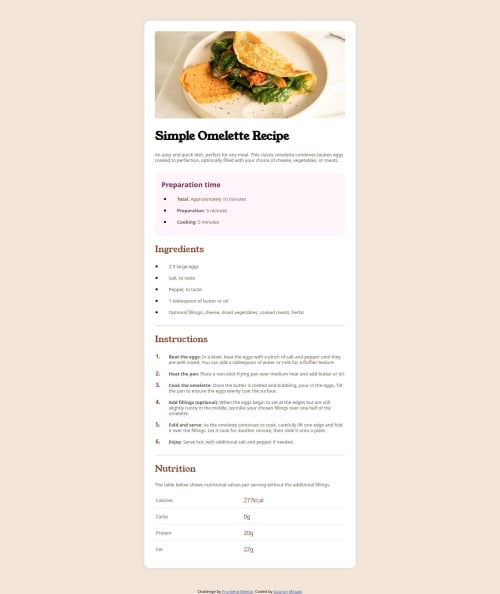
Solution retrospective
What are you most proud of, and what would you do differently next time?
Very nice project. I learned a lot
What challenges did you encounter, and how did you overcome them?I faced some problems with the font that took me a lot of time. However, I was not able to enter it properly.
What specific areas of your project would you like help with?I would like advice on using the font correctly
Code
Loading...
Please log in to post a comment
Log in with GitHubCommunity feedback
No feedback yet. Be the first to give feedback on MGDev25's solution.
Join our Discord community
Join thousands of Frontend Mentor community members taking the challenges, sharing resources, helping each other, and chatting about all things front-end!
Join our Discord